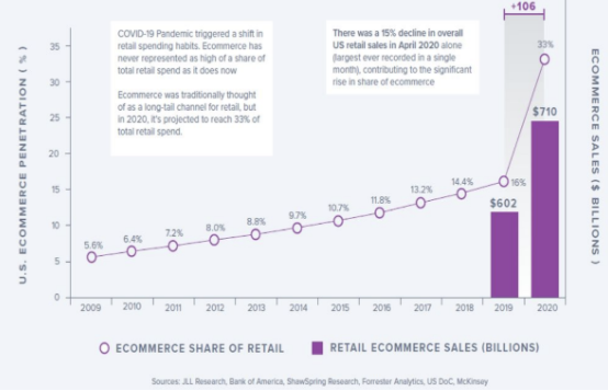
Nowadays, it doesn’t require a ton of technical skill to build a website. Because of the number of ecommerce platforms available today, you don’t have to be a coding expert to build a useful online store. The platforms take care of the heavy lifting for you.
That said, you need a basic understanding of what good web design is, so you can take the themes and templates and transform them into something that truly showcases your brand.

We’ll look at what makes a good ecommerce website design and follow that with 29 examples you can use for inspiration.
What Makes an Ecommerce Website Design Good?
Consistency
Keep a consistent design across all the pages on your website. You can use a different layout for product pages than your blog and other web pages, but the color scheme, navigation menu placement, etc., should remain the same.
Use the same fonts, logo placements, and so on to keep the design consistent across the entire website. It creates a cohesive brand and is necessary for a great ecommerce website design.
Visual Appeal
Visual appeal is critical since people cannot physically browse your products and store shelves. You want your customers to be able to see themselves with your products. Your website visitors will get their first impression of your online store within a few seconds.
You need high-quality images because customers can’t touch or try your products beforehand. The visuals will help people decide if they want to make the purchase. Use a combination of product images against a white background and lifestyle shots that show your product in use.
You’ll have guidelines to follow when selling on a third-party website, such as an online marketplace. With your own website, you’ll have complete control.
You’ll also want to choose a limited color scheme that’s easy on the eyes. Too many colors or bright clashing colors will turn people away. You want a main color and an accent color to create some contrast. You want a font that’s easy to read. And lastly, you’ll want to ensure your website is accessible to those with vision and hearing issues.
Trust Signals
If you walked into a retail store and found it messy, with employees standing around talking as if you weren’t there, would you continue shopping or head straight for the nearest competitor?
When someone visits your online store for the first time, they likely don’t know much about your brand, product quality, or reputation. Promotions may make them consider you, but you have to earn their trust before they convert.
People need to know that when they purchase from you, they will receive exactly what you advertised.
That means having trust signals on your website, such as:
- Contact information – Physical address if you have one, email address, phone number, etc.
- Return policy – Show people that you will accept returns if they’re unhappy with their purchase. Set expectations from the beginning.
- Trust badges – Demonstrate your website security with multiple payment methods and security seals.
- Social proof – Customer reviews, testimonials, etc.
User Friendly
Website navigation is crucial to making your website user-friendly. Not only does it ensure customers can find what they’re looking for quickly, but it also helps with search engine optimization (SEO).
Good navigation sets the tone for a positive online shopping experience. Keep it as simple as possible, and ensure you have a smart search function that helps people find what they’re looking for.
For instance:
- Home
- About Us
- Shop (with a sub-menu that lists out product categories or a menu that individually lists out each product category.)
- Contact Us
Include a variety of payment options so shoppers can choose the one that’s most convenient for them.
29 Ecommerce Website Examples and What Makes Them Great
1. Mahabis
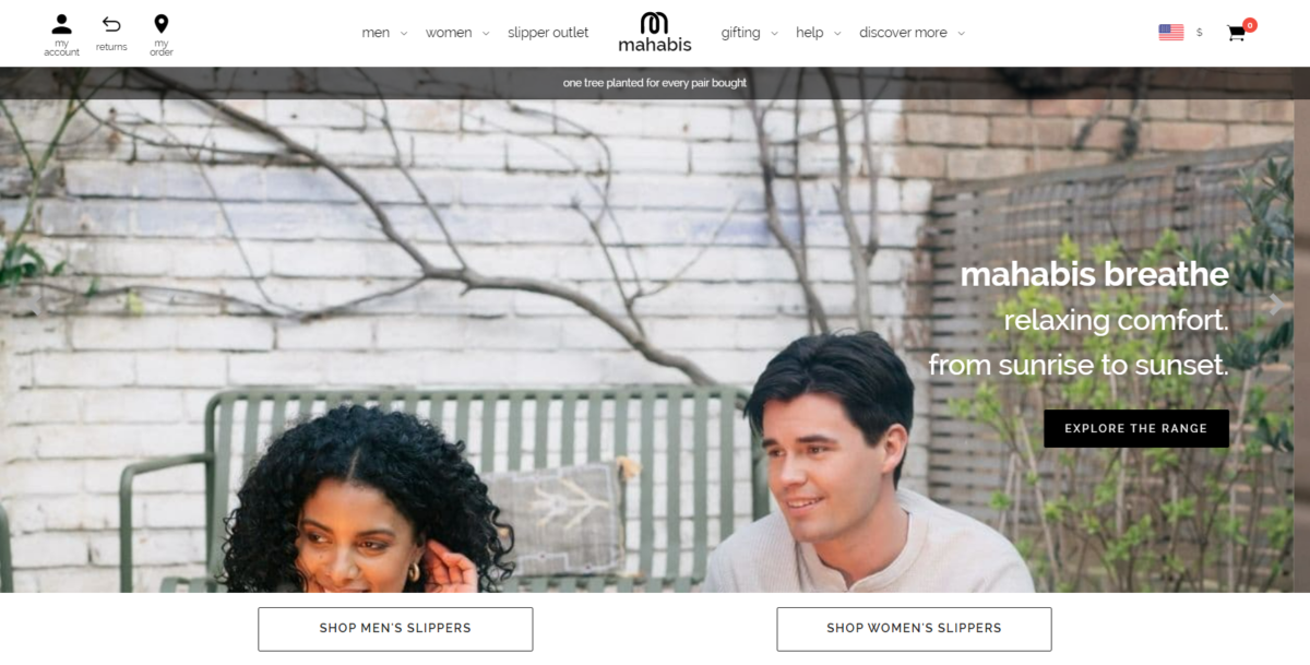
Mahabis is a shoe retailer. The homepage includes a slideshow that highlights their products immediately, with a number of small details that entice buyers. The site is clean, crisp, and easy to navigate. It creates a classy feel, replicated in the product.
2. Bliss
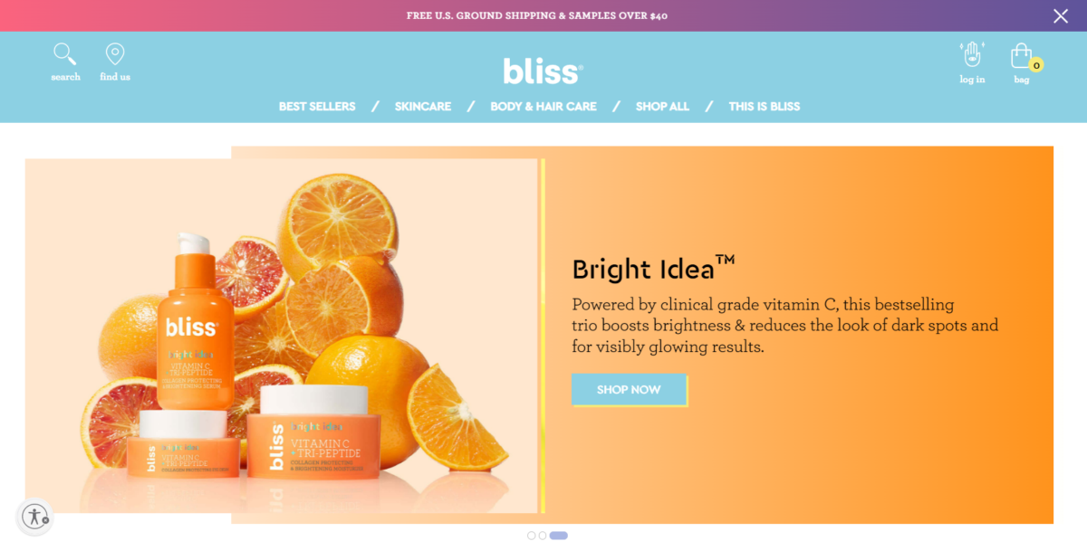
Bliss is one of the best ecommerce design examples on this list. BigCommerce powers this website. Bliss earned a spot as one of BigCommerce’s Best Overall Design finalists in 2020. Part of what makes this ecommerce website design so great is the light and carefree feel you get as you interact with it. For a skincare product line, you can’t go wrong with this – it does a great job helping visitors imagine what they’d feel like after anything in the range of products.
3. Hebe
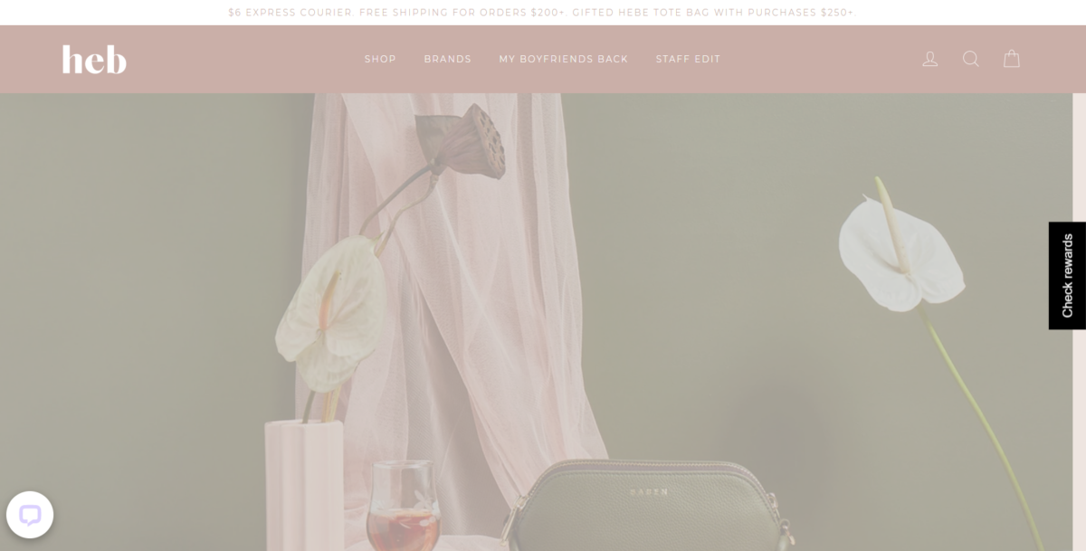
Hebe is an online boutique. While the animated logo in the header may distract some visitors, they get the visuals right. The large photos on the home page set the tone for the rest of the site, and the navigation makes it easy to find whatever you’re looking for.
4. Ambsn
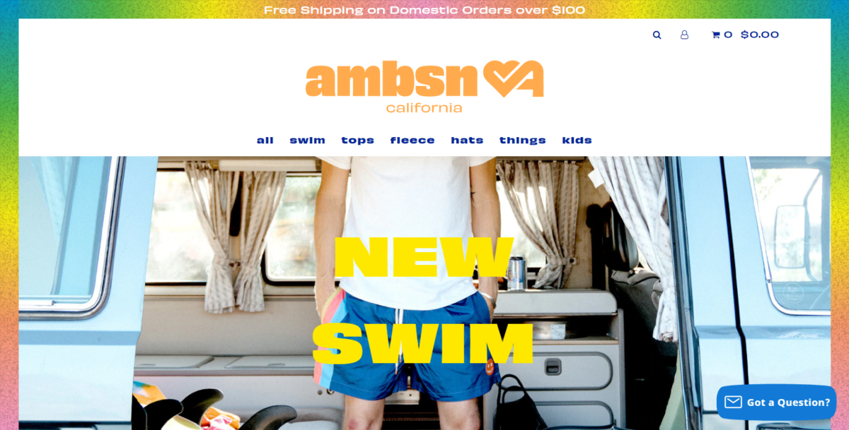
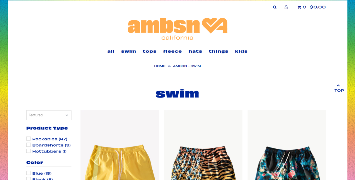
Ambsn is one of many online stores on this list not afraid to embrace vibrant color. A California brand focused on beachwear, the navigation is simple, and the visuals make you think about fun in the sun. Navigation is broken down by product category, and items are shown on product category pages in a grid format, to further simplify the buying process.
5. AztecaSoccer
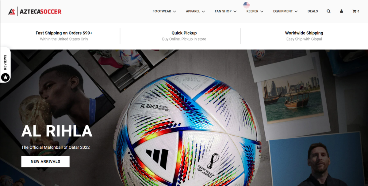
AztecaSoccer uses a clean design that’s easy for people to navigate through. The retailer sells soccer equipment, footwear, and apparel. While they use product images, they’ve also created a boutique feel with a wide range of lifestyle shots.
6. Bon Bon Bon
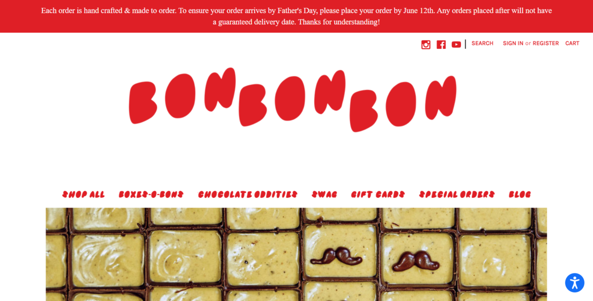
Bon Bon Bon sells artisan chocolates online. The website design is cheerful and fun. It uses excellent color without creating a harsh look on the eyes. The beautiful design is also fun and carefree, which is what most of us feel when we eat chocolate.
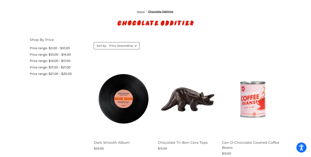
Bon Bon Bon also has easy-to-use product category pages. As shown below, customers can select their product category from the site’s main navigation menu, then further filter their product choices by price range, and sort low to high or high to low.
7. Allbirds
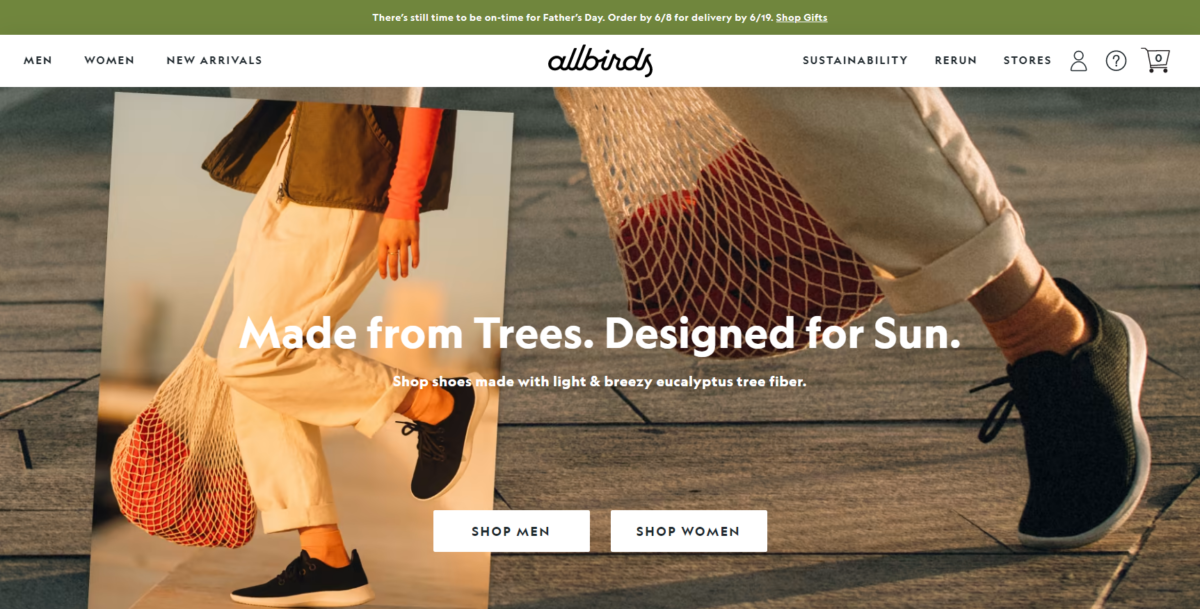
AllBirds, an eco-conscious apparel brand focused on sustainability, uses a combination of product and lifestyle shots to show visitors how awesome their products are. Their copy and calls to action are what separates them from other apparel brands on the market today, with
“Summer’s Natural Sweeteners
Two new styles made with cushiony, sustainable sugarcane. The Sugar Series is ready for the sun, how about you?”
right on the homepage.
8. Dress Up
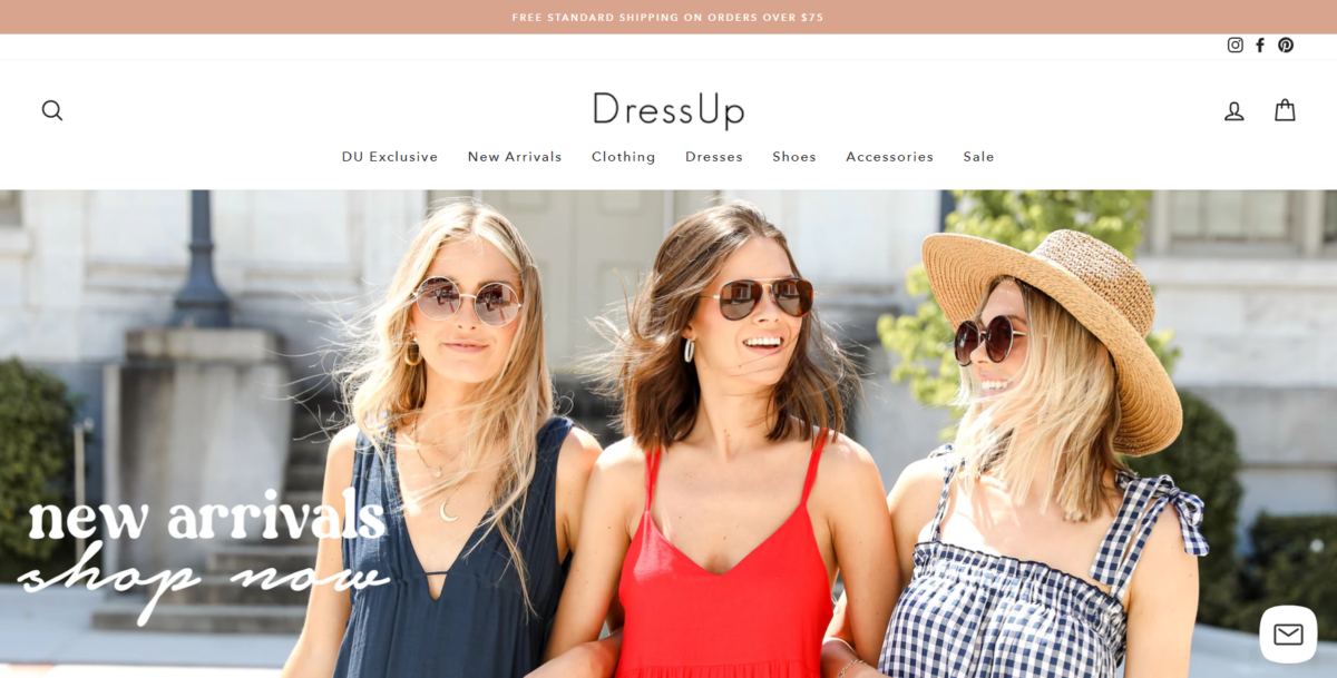
DressUp is a fashion store for women. They’ve recently redesigned their website compared to what was on similar lists of great ecommerce websites like this one. They’ve gone from bright colors and bold typography to a more subdued, classy look. Both have served them well, as they do a fantastic job showcasing women’s fashion with product and lifestyle images.
9. POKETO
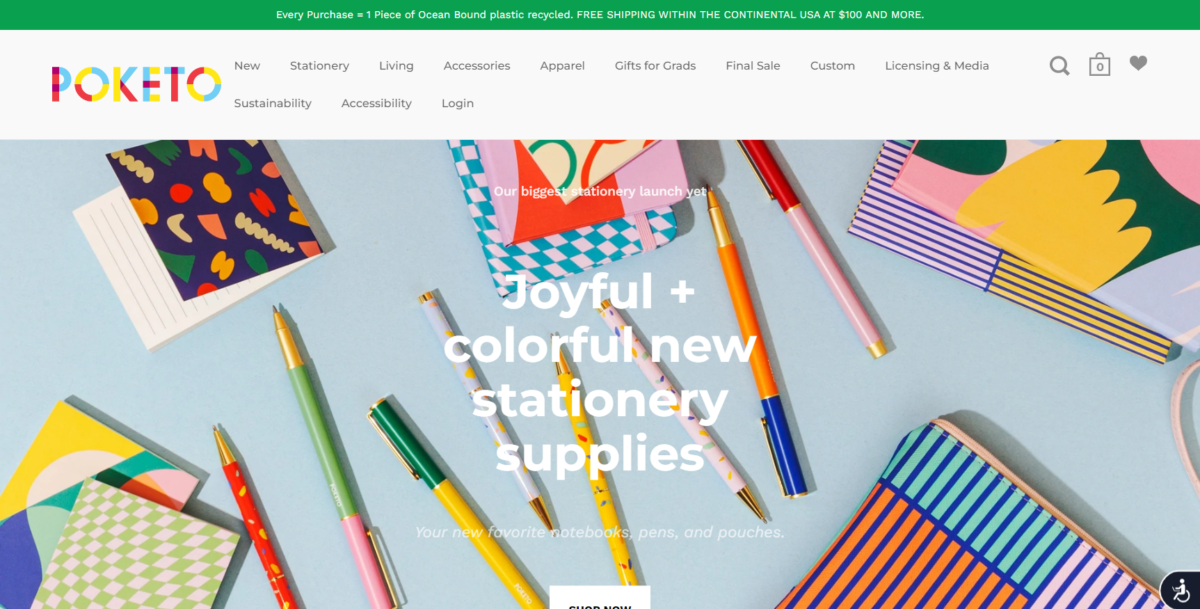
POKETO is a great demonstration of what bright colors can do for a website when used correctly. The navigation menu makes it incredibly easy to find what you’re looking for since everything is lined across the top. The white font against the multi-colored background makes the copy and calls to action easy to read.
10. Chubbies
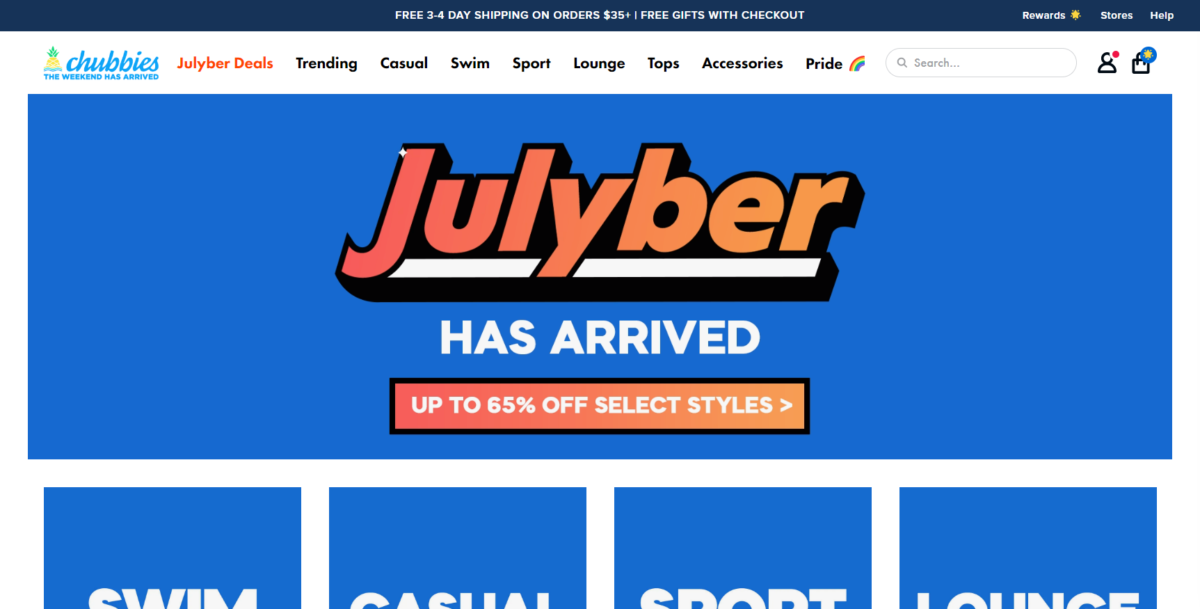
Like many of the other ecommerce stores on our list, Chubbies makes terrific use of color. This, combined with their clever copy, makes it no surprise that they’ve built a following of men who love short shorts. Though past versions of the site have included unconventional sidebar navigation, the new version with the search bar makes it easy for visitors to find anything on the site.
11. PopFit
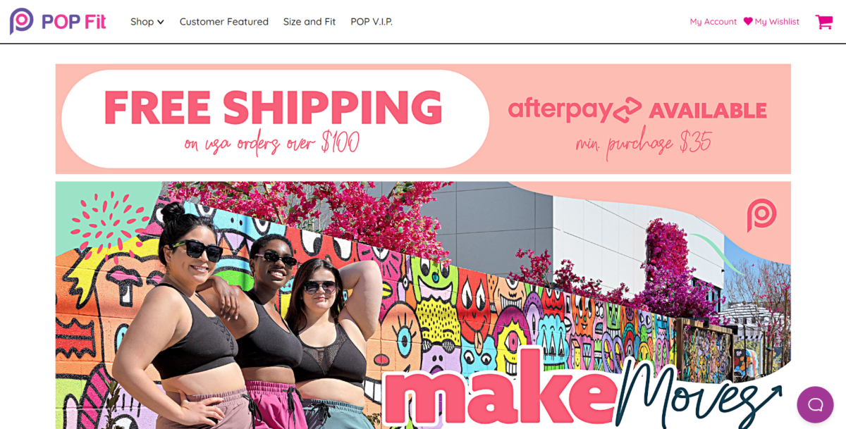
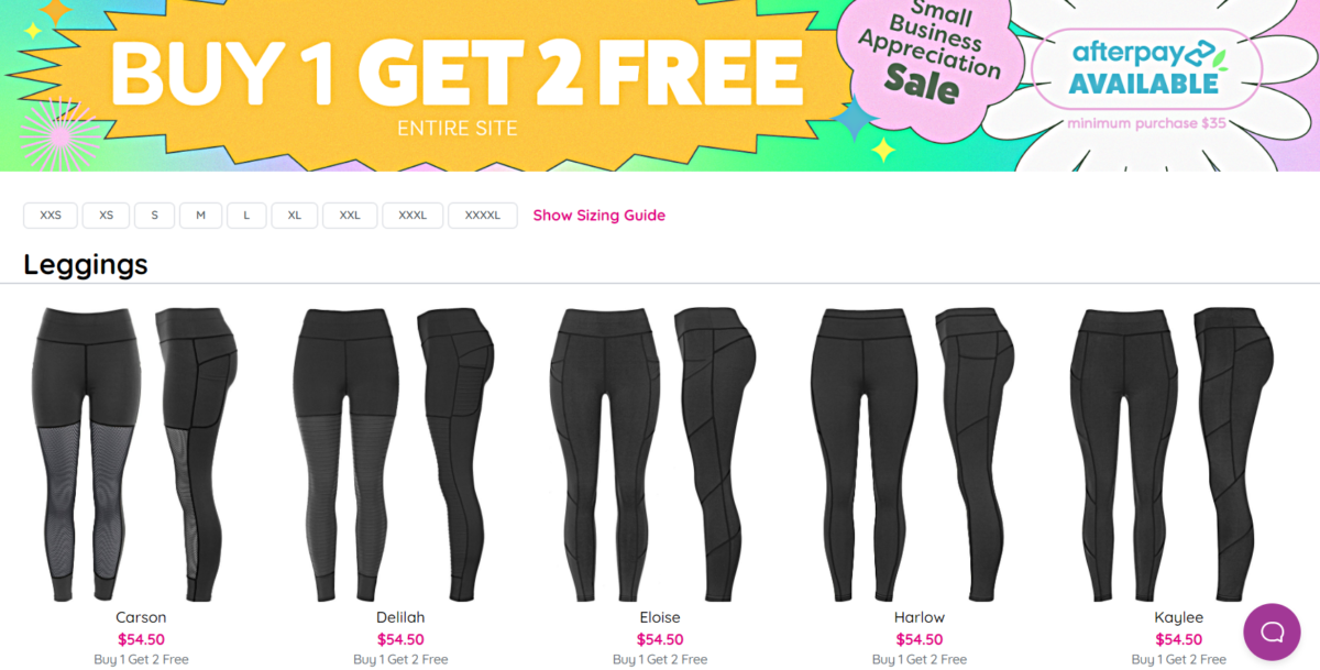
PopFit Clothing is an athletic clothing company for women, specifically designed to provide comfortable clothing that won’t ride up during a workout. They use bright and bold colors and highlight real women of all shapes and sizes, to showcase how their products work for all bodies.
PopFit has product category pages for each item they offer: Leggings, Joggers, Crops, Tops, Shorts, Sleep Sets, Underwear, and Accessories. Each product category page lists each item, along with sizing filters to help narrow down choices quickly and easily.
12. Helbak
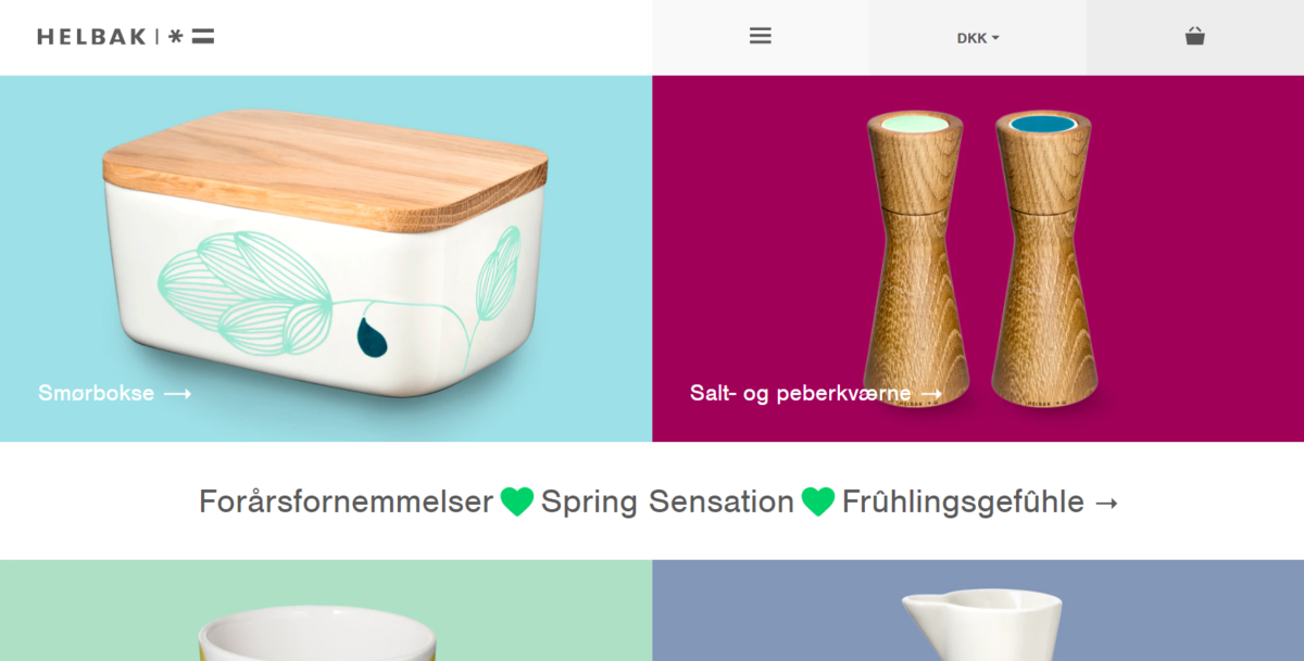
Helbak puts its products front and center with a minimalist design and a bright color scheme that doesn’t make you feel like you’re looking directly at the sun. The overall design is clean, which creates a classic look that highlights the products.
13. Decibullz
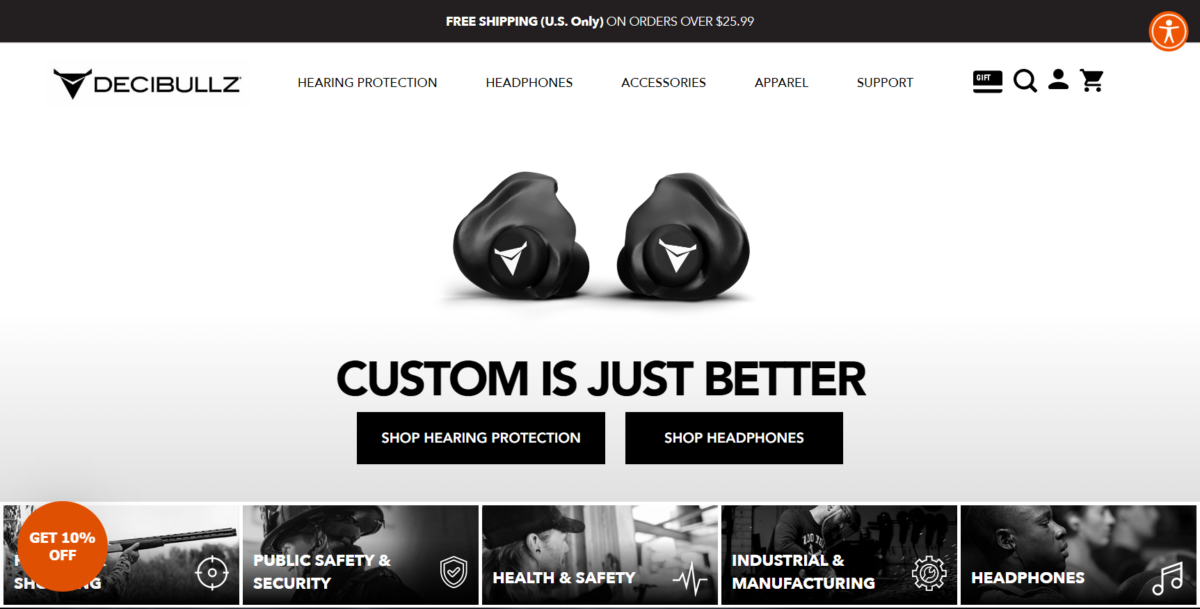
Decibullz offers a great example of how you can use larger images successfully. It requires a fast website since the image files are larger. While many websites on this list use color successfully, we love that this one is just as beautiful even though it uses primarily black and white. The contrasting color makes it easy for the call-to-action buttons to “pop” off the screen.
14. MeUndies
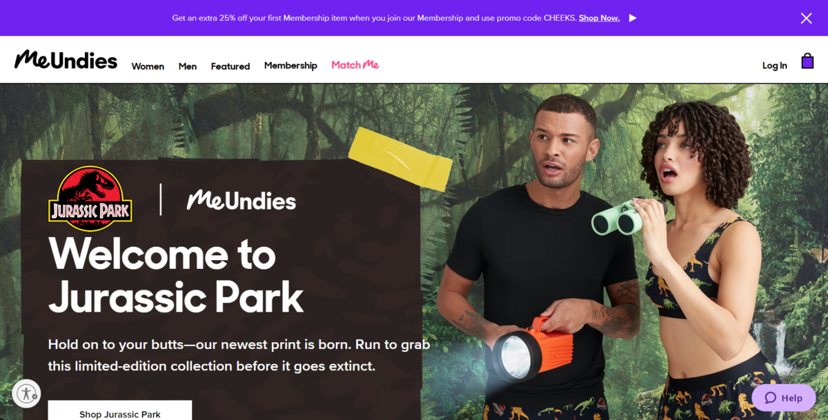
MeUndies is an excellent example of how to use color to show off your products. A predominantly black and white color scheme makes highlighting the products easy since they are colorful.
15. URevolution
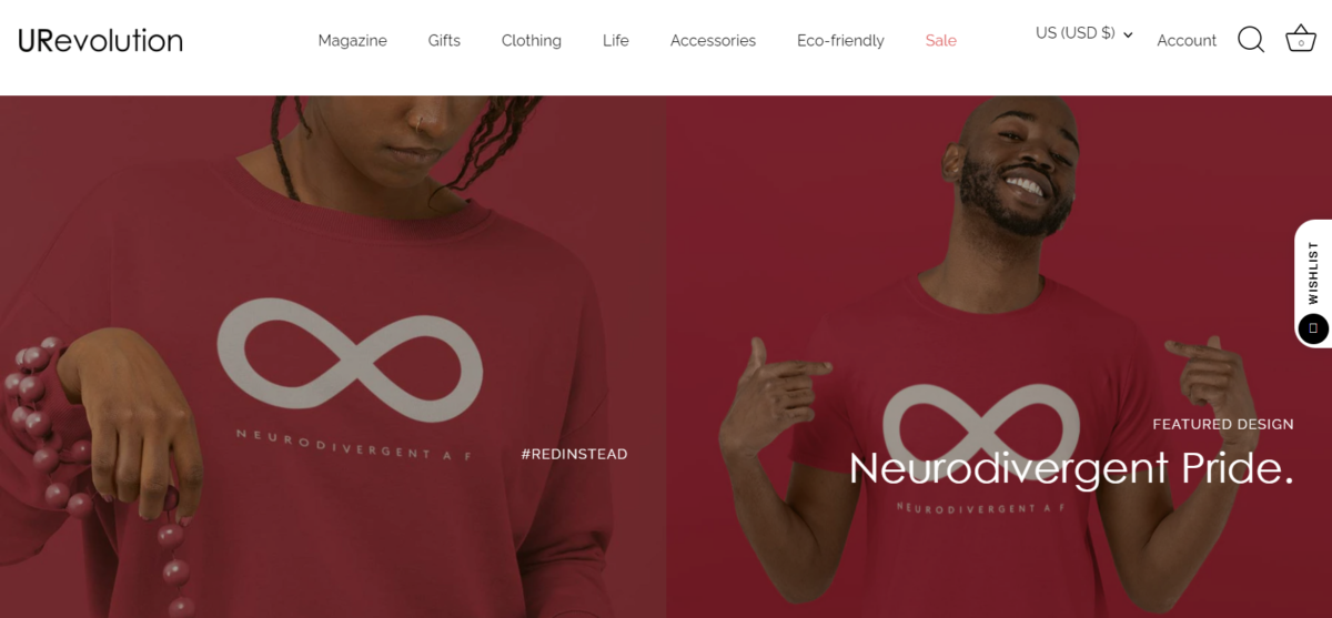
URevolution is a clothing line dedicated to making a difference. Focused on inclusion, body positivity for every body, and eco-friendly products, this Black, disabled, woman-owned business is taking a stand. This brand stands for making a difference, and the website design makes it easy for everybody to purchase products and share their experience. The design highlights the products using real people, not just models.
16. Warby Parker
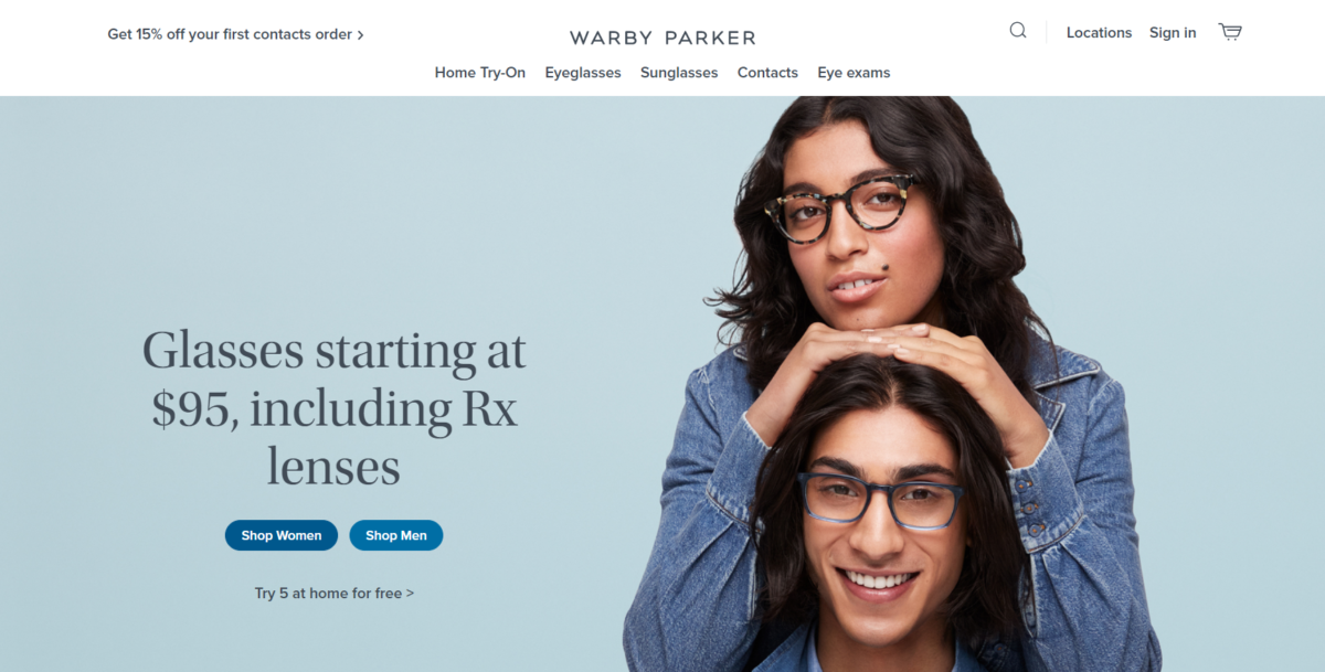
Warby Parker is a popular online glasses retailer. The clean design makes it easy to “try on” various pairs of glasses before committing to the one you want to buy. Product photos clearly display what the glasses look like and the home try-on option gives shoppers reassurance before spending their money. The navigation is clear – simply choose the type of eyeglasses you’re looking for, then choose whether you’re shopping for men or women.
17. Dick Moby
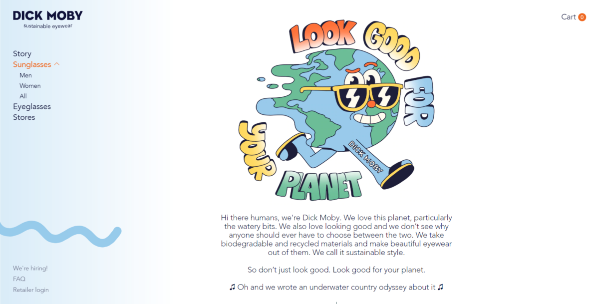
Dick Moby goes against the grain a bit. Most of the websites on this list use a combination of color and photography to set their brand apart. Dick Moby adds a bit of fun with partners to really customize the feel of their site. The one thing that’s immediately clear about the brand is its eco-friendly stance.
18. The Mountain
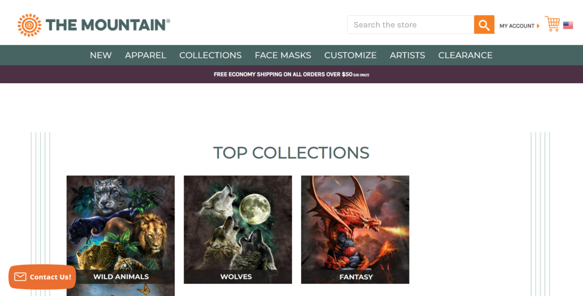
The Mountain is another BigCommerce-powered website that was one of the finalists for the best overall design. They use a basic color scheme that allows the product images to really stand out. The navigation is simple, but the search bar makes it easy for people to find whatever they are looking for.
19. Frank Body
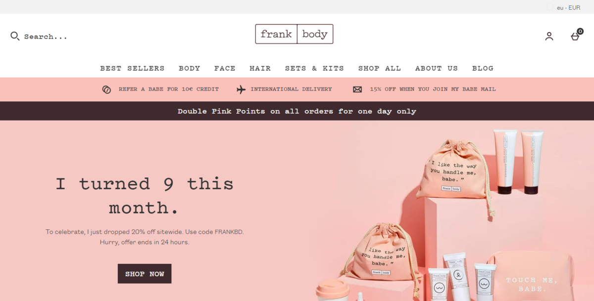
Frank Body is a health and beauty website that perfectly demonstrates how a monochromatic color scheme can work to build a striking brand. Another thing that really stands out about Frank Body is their quality copy.
20. Leaf & Clay
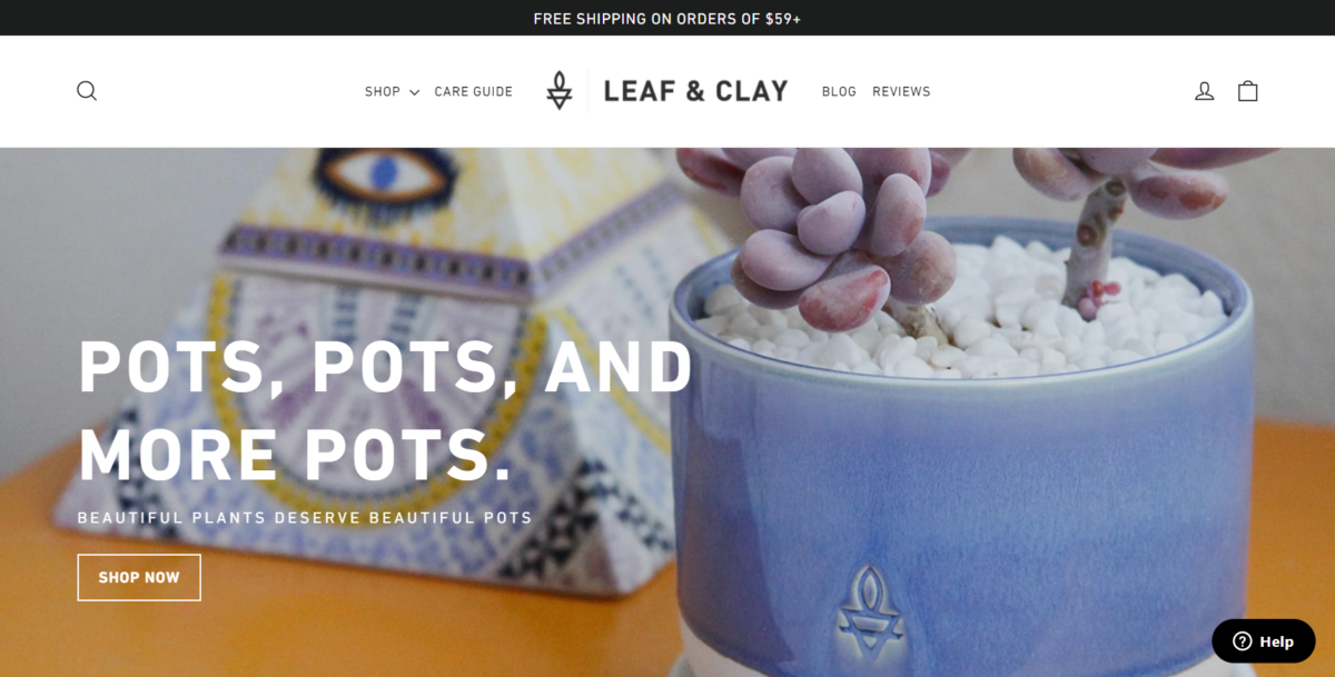
Leaf & Clay is a plant company. Their ecommerce store is easy to browse through just from their homepage. It breaks the site down into various categories by plant type, such as cacti, low light, weirdos, rare cultivators, new arrivals, and best sellers. Clicking on the category takes users to a list of plant products that fit into that category, so even those with a brown or black thrumb will be able to find plants they can keep alive. What could be easier than that?
21. Ritual
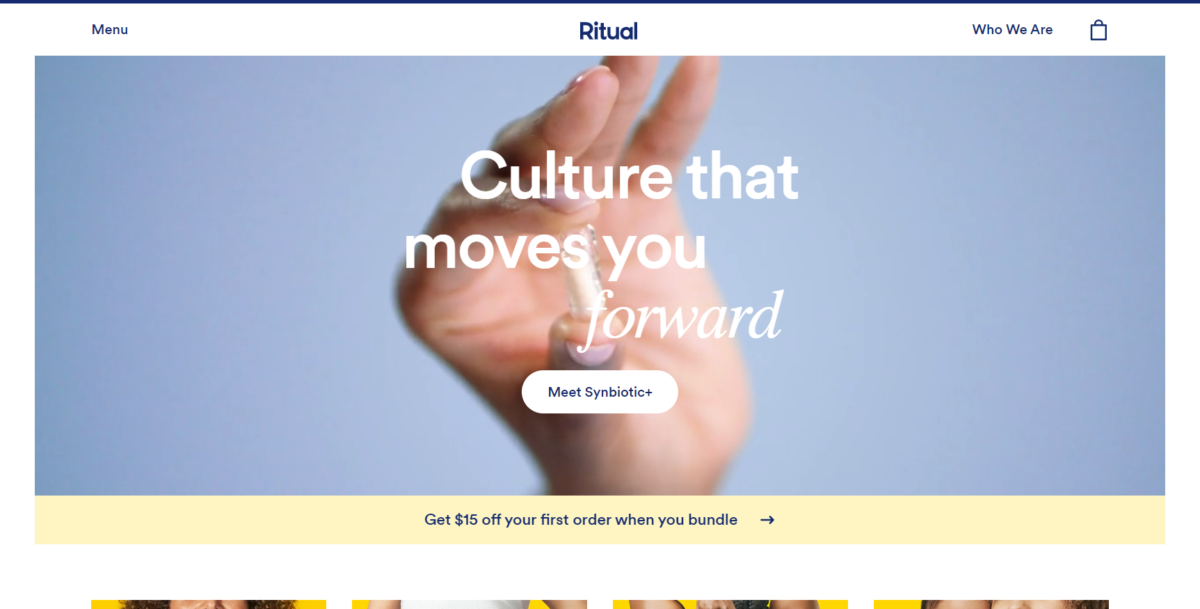
Ritual is a woman’s vitamin company, known for its bright yellow and navy color scheme. The color is energizing, which is what we associate with vitamins. Subconsciously, when we see that color, we’re thinking the vitamins will energize us if we use them, and that’s exactly what Ritual wants.
The site navigation is easy, with product categories available to shop directly from the home page, including Multivitamin, Gut Health, Protein, and PRegnancy. Product benefits are displayed right below those categories, to show you how Ritual vitamins are different from the others out there – traceable, non-GMO ingredients, safe for vegans, with no artificial colors.
22. Premium Teas
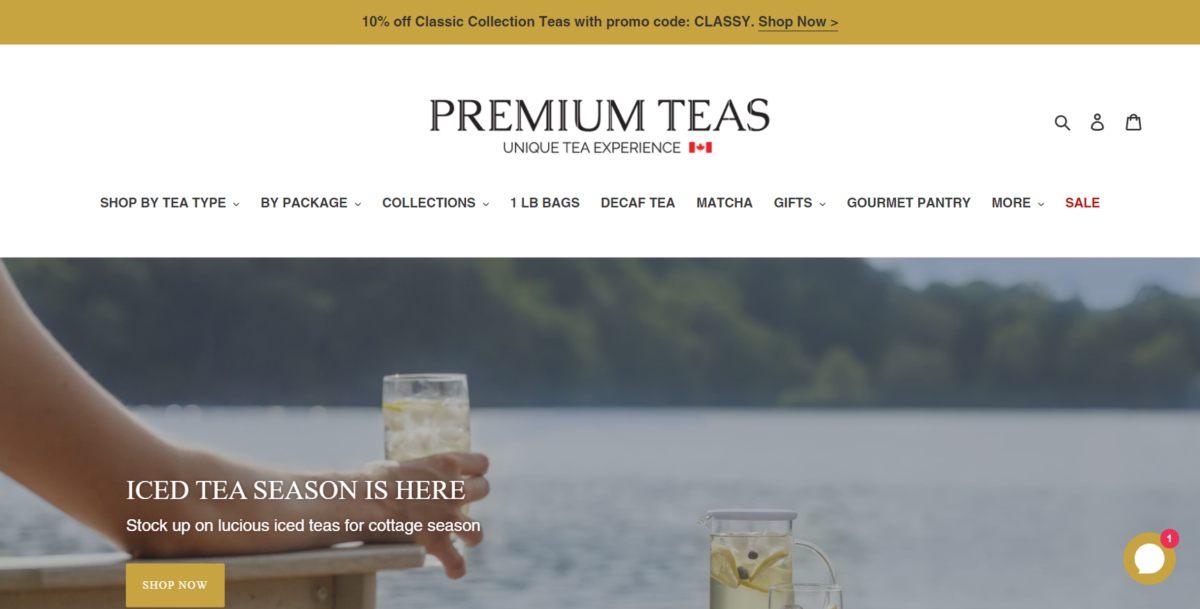
Premium Teas is a wonderful example of how to take a sophisticated product like tea and transform the website that sells it into something equally sophisticated. By focusing on letting the white space do the work, the design is clean, with plenty of high-quality images to showcase the products on the commerce site.
23. Native Deodorant
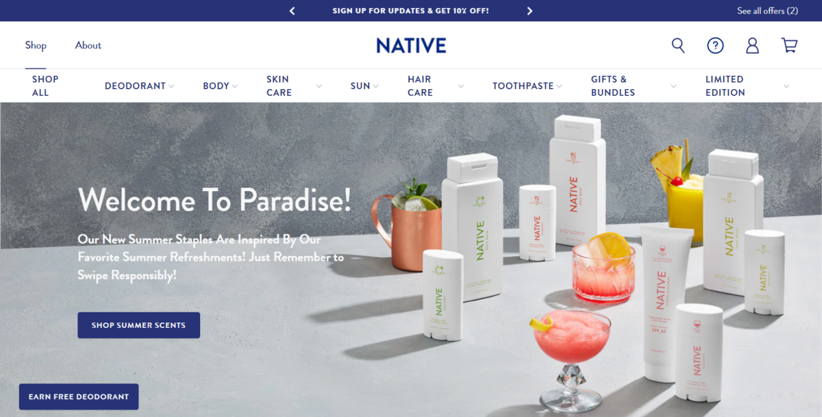
Native Deodorant shows how to make things as simple as possible with a streamlined product page experience. The more product pages you have, the more the user experience tends to suffer. By consolidating its product offerings into three product pages: Women, Men, and Sentistive, Native has improved the user experience on its ecommerce store. After the user clicks the main product they want, they can choose the scent they want, which keeps things easy compared to having a product page for each individual scent and type of deodorant.
24. Soylent
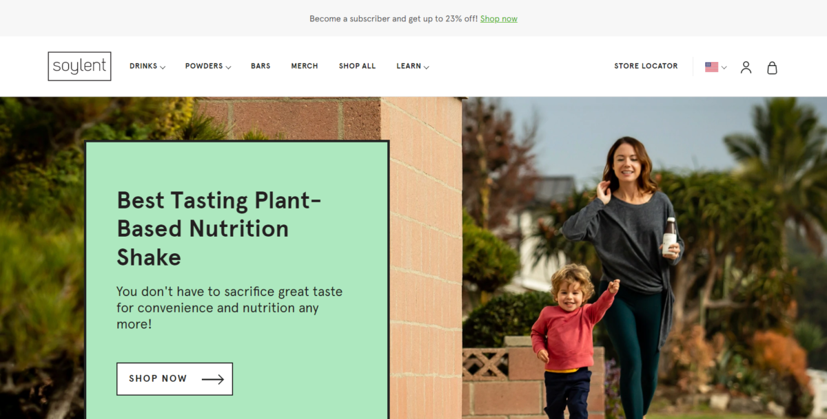
Soylent, a manufacturer of plant-based nutrition shakes, uses a clean design with a combination of product photos and lifestyle shots. The plant-based product lends itself to a light color scheme using colors like green and brown.
The site navigation breaks the products down by category, making it easy for people to find whatever they’re looking for. THere’s also a section dedicated to learning, which helps educate customers about the plant-based ingredients and how Soylent can be used as part of a healthy, balanced diet.
25. Ratio
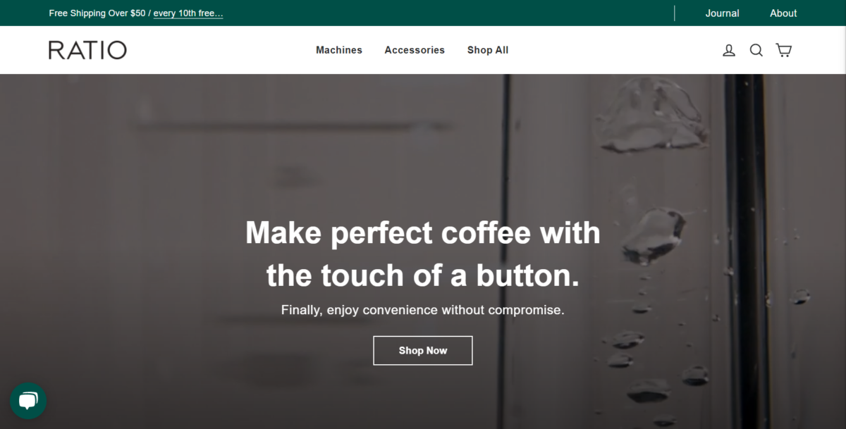
Ratio is a coffee ecommerce business that demonstrates the balance between color, photography, white space, and typography. The result is a clean, classic design that’s easy to navigate. Each product page provides descriptions of the coffee in a way that makes it clear you’re dealing with a high-end commodity.
26. 100% Pure
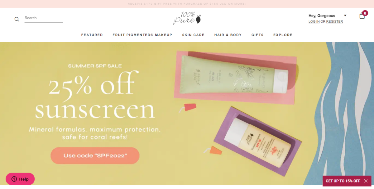
100% Pure is proof that you don’t need a fancy ecommerce site to be successful. Keeping it simple, as long as it’s easy to navigate from one page to another, is better than creating a cluttered ecommerce store design in the name of creativity.
27. Simply Chocolate
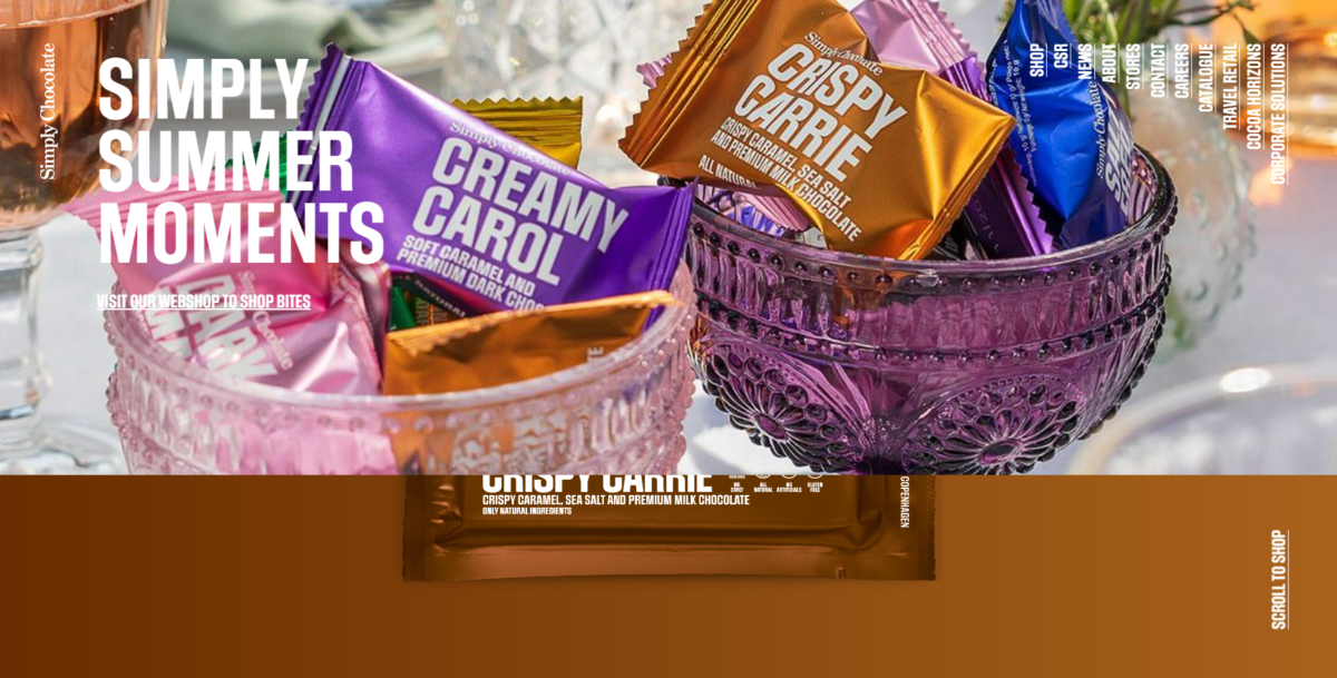
Simply Chocolate, based in Denmark, allows the individuality of each product to shine, which makes it a solid ecommerce website design example. As you scroll through the home page, a new product (and colorful wrapper) rises to the top of the screen, with a link to shop. The top half of the screen is a color similar to the main ingredient (other than chocolate) with the bottom half of the screen featuring images of the ingredients (chocolate, berries, etc) in the Fit Fionia Protein, Red Berries, and Premium Dark Chocolate bar.
28. Stay Home Club
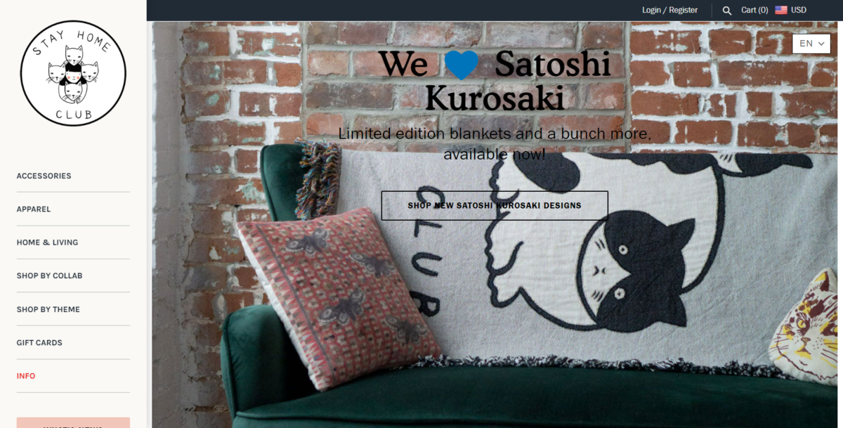
Stay Home Club is a lifestyle company that easily demonstrates how to make the white space of design work for you. Combined with pops of color, the brand conveys a casual and laid-back feel, while still keeping the website easy to navigate. Customers know the brand is tasteful, but is about fun, too.
29. Beats By Dre
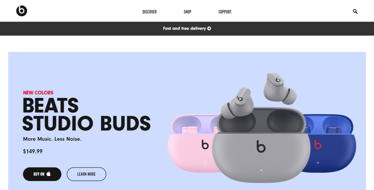
Beats By Dre needs no real introduction, as the brand is fairly well known. But, with headphones – it’s all about the sound – so promoting them visually is a bit of an undertaking. While many brands shy away from using loud colors like bright red, Beats by Dre shows how it can be done well on an ecommerce site. The white text on the red background really makes the calls to actions stand out.
Tips For Designing an Ecommerce Website Design
To make the most of your ecommerce website design, focus on your customer experience first and foremost. Use these tips to help you throughout the design process.
Follow the KISS Principle
KISS stands for Keep it simple, sweetie. The basic premise is that whenever you are building something, you should keep it as simple as possible. Simplicity ensures that users across the board will be able to access and navigate your website with ease.
Make Branding a Priority
When shopping online, people want to make purchases from established brands, and one of the best ways to do this as a newcomer is to build trust with branding. Your branding is the foundation of your ecommerce business because it demonstrates who you are as a company, what you’re about, and how you’re different from your competition. A well-thought-out brand will build stronger connections with your prospects, in turn, increasing conversions and sales.
For help establishing your brand, ask questions such as:
- If my brand were a person, who would they be?
- What makes my brand different from others in the same niche?
- What do we do better than anyone else?
- What three words would I use to describe my brand?
It’s only after you figure out who you are that you can work it into your ecommerce website branding.
Think Like Your Customers
To ensure your website design that resonates with your audience, put yourself in their shoes, and think about the customer journey from discovery through support after purchase. Ultimately, all your potential customers want and an ecommerce experience boils down to a website that’s easy to use, designed well, and keeps the process of shopping as straightforward as possible.
If you’re not sure what your target customer wants, consider doing a bit of market research or working with a focus group. Have them indicate the layout that will be easiest for them to navigate, give you feedback on the optimal way to organize your product, and ways to make the checkout process simpler.
By thinking like a customer, you’ll be able to anticipate what they want from your ecommerce store and then design your website in a way that meets those needs.
Make Color Work for You
As tempting as it may be to choose your favorite color and a few variations that work well alongside it, selecting the color scheme for your ecommerce website is so much more important. Color evokes emotion and can spur action from people. If you want your ecommerce site to convert clicks into sales, use color theory to your advantage.
If you’re struggling with where to start, think about your brand story. Blues inspire calm and trust, (that’s why you’ll find it in more than half of all logos!) while green is associated with health and wealth. Red can ignite passion and promote feelings of excitement, so it’s always a good option for calls to action and other design elements that you want to stand out.
Don’t Skimp on Image Quality
Images are known to increase conversions. A case study found that incorporating more relevant high-quality photos into a website design increases conversions by more than 40% and it holds true with ecommerce as well.
No one will purchase a product sight unseen. If you want people to buy, you need to show them what they’re buying and you do this with high-quality product images. Investing in professional images of all your products along with images shown from various angles will help build confidence and trust in your offerings.
Pay Close Attention to Your Content Formatting
At first, it may seem like a long product description is ideal because the more information you can offer someone about your product the better, right? Unfortunately, though, people won’t read it. Data shows that the majority of website visitors only read about 20% of the text on any page. They don’t read the content word forward and instead scanned the text for the key information they’re looking for.
To get your point across, this means you have to make your content scannable by breaking it up into smaller chunks with short sentences and paragraphs. Make use of subheadings and bold text where appropriate along with bulleted lists to call out key elements.
FAQs
Final Thoughts
When it comes to selling online, the quality of your ecommerce website design matters. Of course, your product, target audience, and marketing matter, too, but if you have a poor website, it doesn’t matter how awesome your products or services are. The best ecommerce website is one that is easy to use, regardless of what you’re selling.
