Website design plays a significant role in the success of online stores. Not only do potential customers make buying decisions based on the visual design of the ecommerce store, but they also want something easy to use, navigate, and make a purchase.

If you’re looking for examples of the best ecommerce website design, you’re in the right place. We’ve compiled 30 examples of ecommerce design to use as your inspiration.
But first, let’s jump into the key elements and design trends every modern ecommerce website design needs to stand out.
What Makes a Great Ecommerce Website Design?
A solid ecommerce platform is more than a home page and a few product pages with scannable content.
Below are a few important aspects and online business ideas that take a new online store from basic to best.

Make It Obvious Where to Click Next
An online store is the digital version of your storefront for your target audience. But unlike the ease of wandering through a brick-and-mortar store, online store visitors need to know where to go next. And that’s where the ecommerce design comes into play.
A website should help guide visitors through the store and, ultimately, to the purchase button!
To do that, your ecommerce site should include:
- Intuitive menu options
- Clear call to actions
- Content (both photography and copy) that encourages taking the next step.
Mobile-Friendly Design
More than half of users online are browsing through a mobile device. This means that if your ecommerce website design doesn’t work on mobile, you’re missing out on the biggest market today.
Mobile-friendly web design means that the site is responsive to the screen’s size, legible, easy to navigate and use, and quick on everything from a laptop to a tablet to a mobile phone.
Be Consistent with Your Branding
Digital marketing starts with building a solid brand identity (from logos to bold fonts and color palettes with earth tones or warm tones).
With that identity, you can begin marketing and selling online. But it takes more than a simple logo and high-quality images.
The ecommerce companies that do a fantastic job understand that consistent branding builds consumer awareness and trust with consumers.
If you’re looking to build consumer loyalty, ensure that your branding is consistent online, in-person, and in any marketing that goes out the door.
The more your potential customer sees – and recognizes you through a visual element – the more likely they will remember your name in the future.
Great Ecommerce Website Examples
Let’s jump into some great ecommerce website design examples, starting with Warby Parker.
Warby Parker
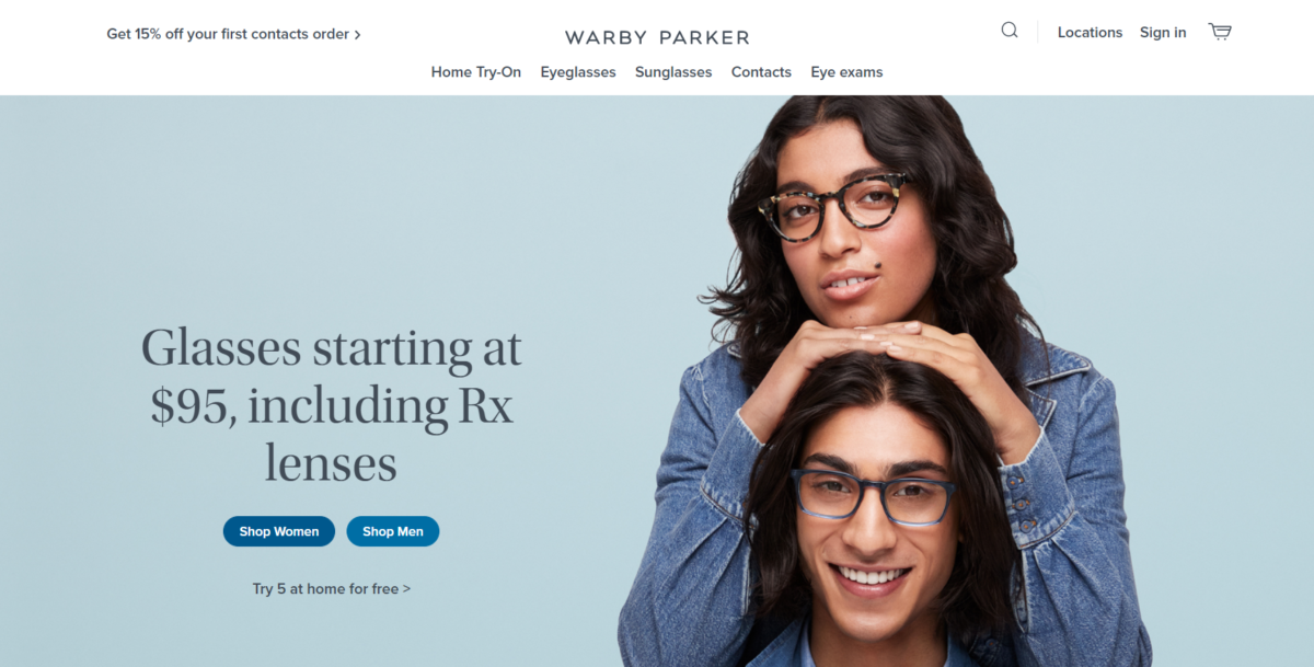
Warby Parker started as a small business with a big idea. They wanted to create affordable glasses and sell them online through an uncommon option to try before you buy.

The Warby Parker website is a great ecommerce sample because of its clean design that features clear product photography and ample white space, both of which make it simple to navigate, select options and make a purchase.
Everlane
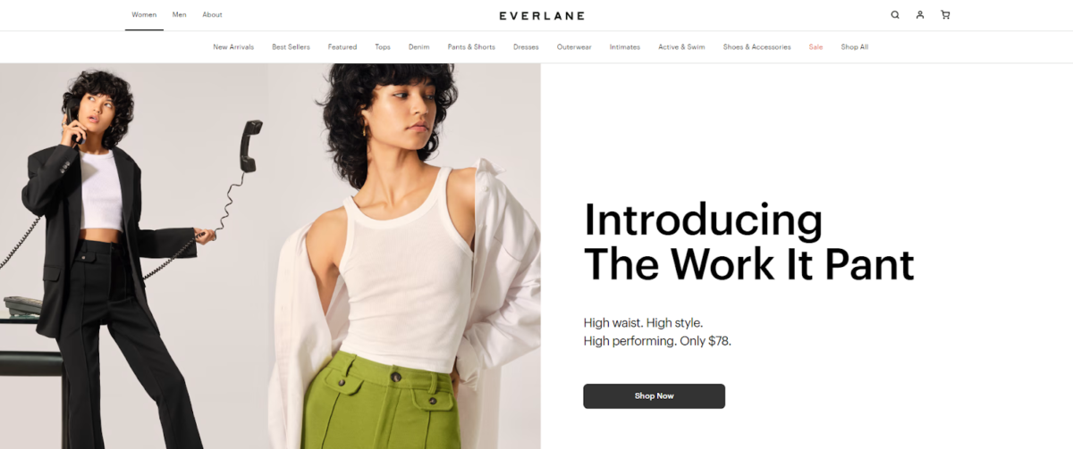
Everlane is a clothing retailer that sells primarily through its website. So, as you might imagine, the website utilizes the best design elements to make browsing selections a breeze.
Everlane utilizes a mix of large, bold product photos against a strictly white background to minimize distractions. And smaller images that serve as a visual selection to navigate into specific collections seamlessly.
Kings Coast Coffee Company
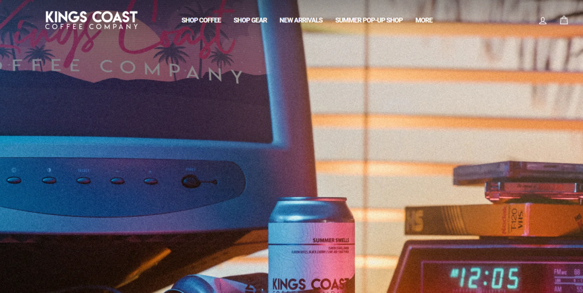
Kings Coast Coffee Company doesn’t just sell coffee (although that is the primary product), so the product categories are broken out to make it easy to get anywhere with just a few clicks.
Kings Coast Coffee Company has also invested in a seemingly endless supply of high-quality product photos that display individual products. They incorporate lifestyle shots that act as vibrant scenes to balance the negative space and draw the target audience into the brand.
Prose
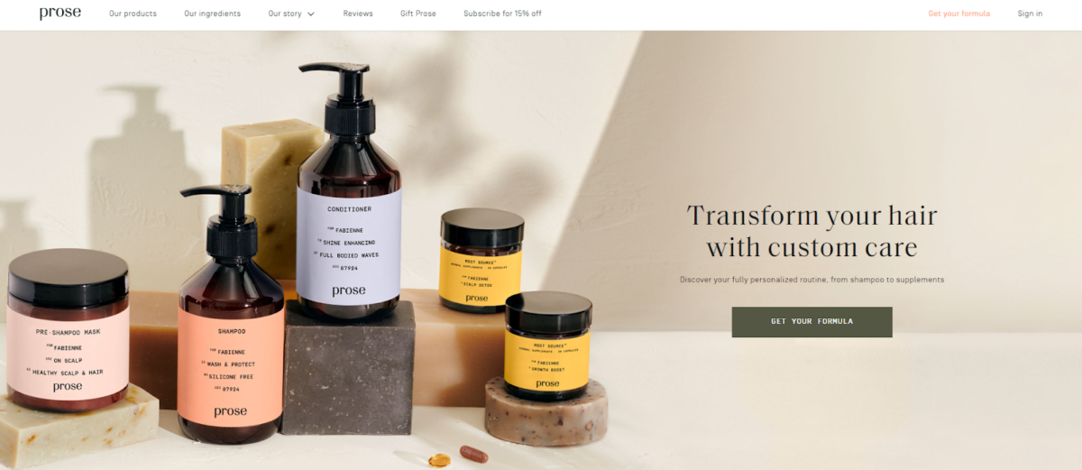
Prose offers customized haircare and lets its products take center stage on the website. But in addition to great photos and product descriptions, the site has fun energy with images of smiling, welcoming people and elements of movement throughout.
None of the unique features detract from a smooth user experience. In fact, the website has a sticky navigation menu that is present as a user scrolls down, making the website easy to navigate from any area.
MeUndies
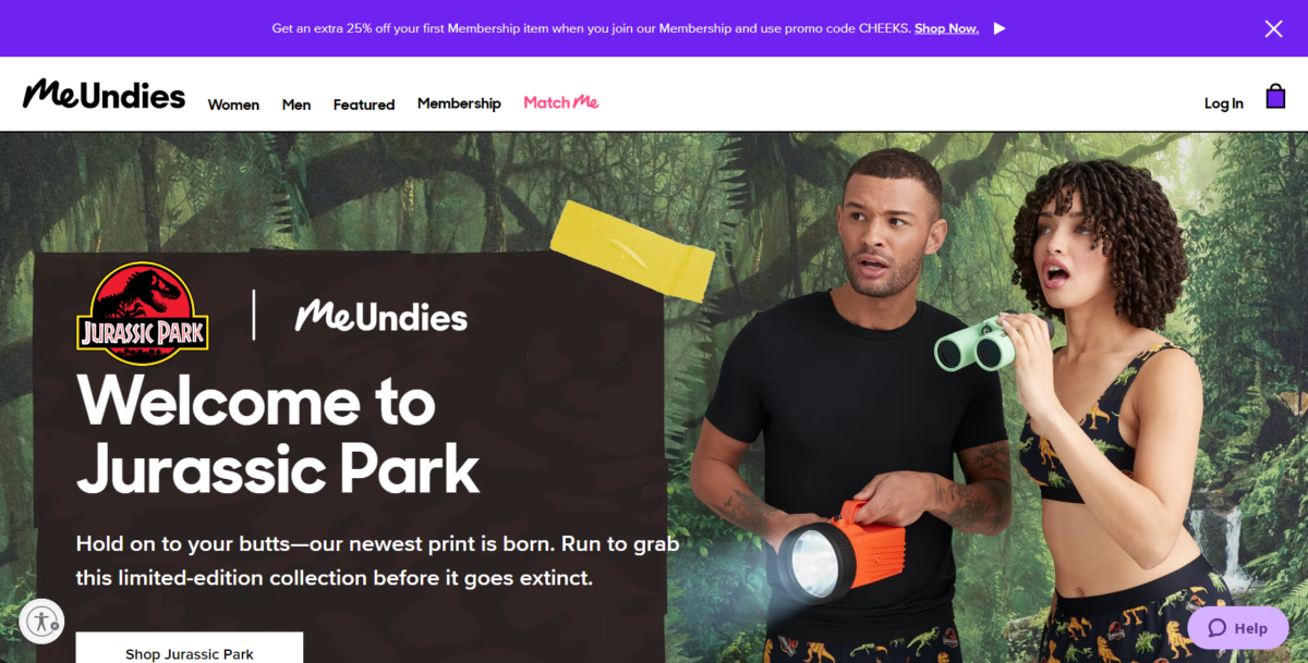
MeUndies is a playful site with unique design examples, including bright colors to support bold photography.
You won’t find white space on the homepage design, but you will see it when moving to select something from the product pages. A mega menu option highlights the products visually and through text, making this well-designed website fun to visit and an easy-to-use shopping experience.

Casper Mattress
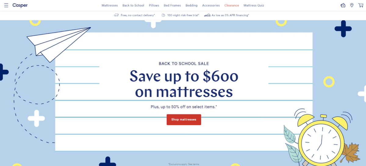
Casper Mattress is an excellent example of an ecommerce website for items that weren’t traditionally bought online. As you might imagine, images are essential, but more so are product categories and descriptions. If you’re not sure where to start, this ecommerce site also has an integrated quiz!
Casper Mattress helps guide the shopper through products easily and makes it simple to shop with a grid layout and bullet lists. This means you can compare options without visiting a different page or old-school mattress store. This marketing strategy means that a broader audience can navigate this online platform and potentially avoid an in-store trip.
Frank Body
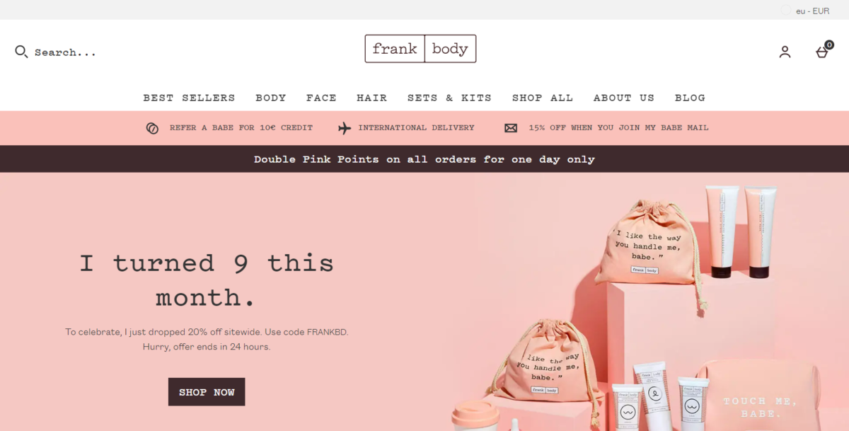
Frank Body is one of the most fun ecommerce website examples. Thanks to its playful, cute designs and bright pink imagery, this ecommerce store makes it easy to scroll through a mix of high-quality photos, products, and even tons of social proof (like testimonials and user-submitted photos). Frank Body has it all, from style to personality.
The Frank Body checkout page is also a breeze, thanks to quick options to save and pay.
Beardbrand
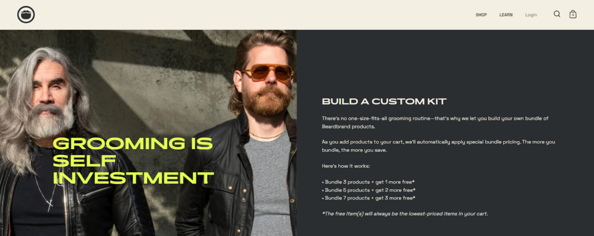
Beardbrand is the perfect example of creating an ecommerce website uniquely. You won’t find a ton of bright photos or too many page options. This brand keeps its website design simple and to the point.
When you start on the landing page, you’ll find a short note, and just below it, an option that guides you to shop. This minimalist design focuses on the most critical aspects of the website – the products. And by doing so, the website’s design is inherently simple to use and navigate, making it one of the best ecommerce stores.
Edible Arrangements
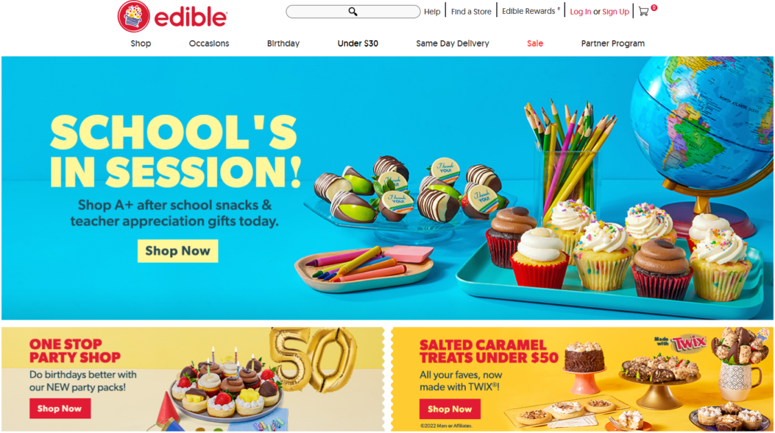
Edible Arrangements sell fresh fruit arrangements that make gifting unique (no flowers here). And while fun product pics showcase the options, the robust details on the inner shop page for each category add this ecommerce website design to the list.

When a user navigates to the product category pages, they’re not only given the product images and details to scroll through, but they can also select options to narrow the choices by price or occasion. These features make shopping online with Edible Arrangements easy and quick.
Ritual
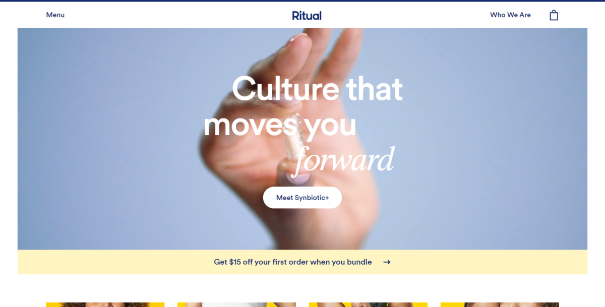
Ritual’s business name tells the story of its products – supplements, multivitamins, and more designed to support an all-natural, vegan wellness routine. Ritual’s ecommerce website design is bright and fun, with close-up photos of the products alone and in lifestyle photography.
One of the specific things Ritual does well is its simplistic menu. The top-line menu remains uncluttered, but when a user selects the hamburger option, a mega menu expands to make the user’s journey through every multivitamin product easy to navigate. This web design is also a responsive design that works the same on any device.
Leaf & Clay
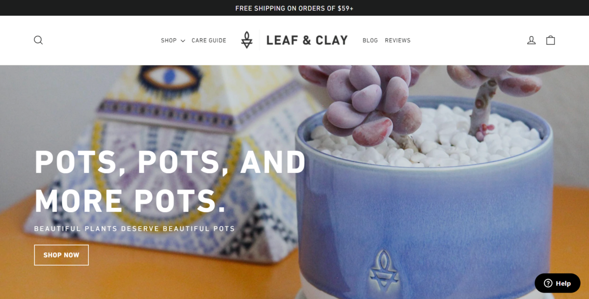
Leaf & Clay is an ecommerce store that brings plants to a customer’s front door using a clean interface.
This website design uses big images that rotate on the header to draw the consumer into the website design. But this Shopify store doesn’t stop there. Choosing a product from the homepage or shop page is easy, and the cart page is just as uncluttered and straightforward to utilize.
Dick Moby
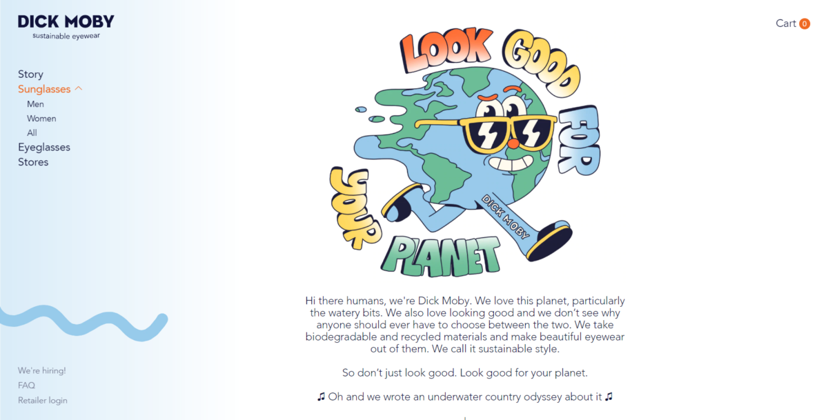
Like Warby Parker, Dick Moby has an online business built on glasses as the key product. Dick Moby’s web design is playful and uses an unexpected mix of lifestyle and product photography with custom design elements and illustrations.
Whether you’re searching for sunglasses, eyeglasses, or a local store, the ecommerce website is easy to navigate. And the playfulness is balanced with facts about products, mission, and sustainable materials.
Helbak
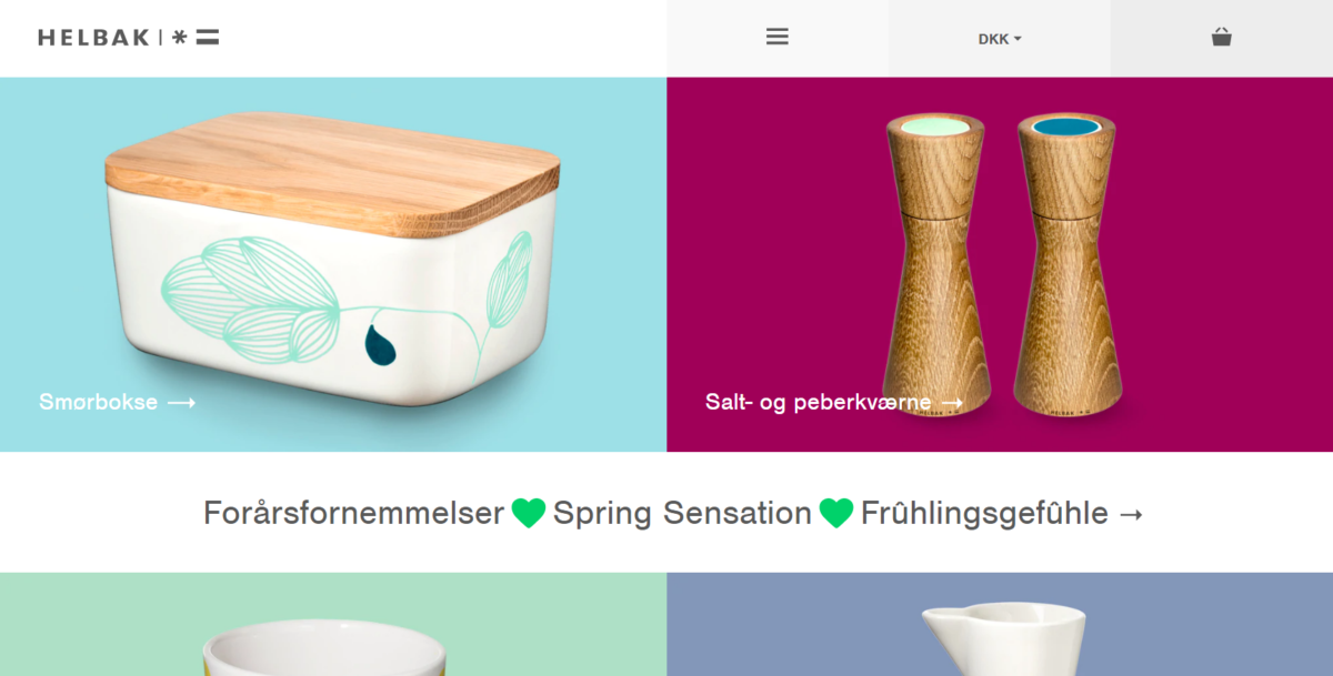
Helbak is an ecommerce website with a ceramic line of products made by a Danish artist. The website design for the homepage is effortless and unique, with four simple pictures arranged as the options to navigate further. Once the user clicks through one product, the results are scrollable and feature the individual designs.

The beauty of this layout is the uncluttered nature that makes it easy to use on laptops and mobile devices. Users won’t get lost and won’t waste time making a purchase.
The Pearl Source
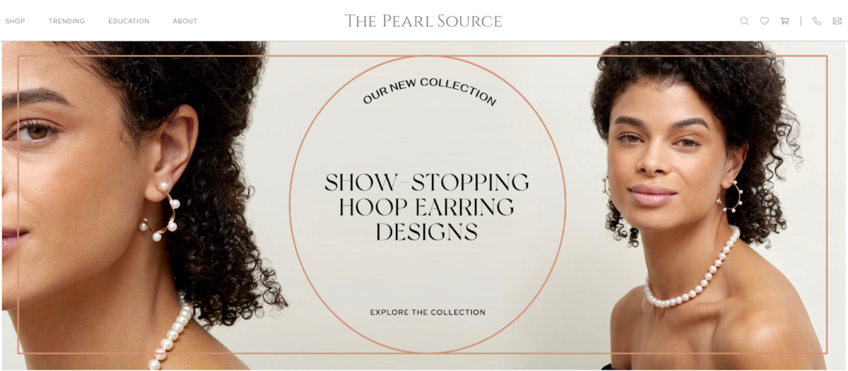
The Pearl Source is an ecommerce website that features nothing but pearls. And as such, the navigation is catered toward guiding the user to understand the product options and the natural materials themselves (including pearl types and sizing).
While the ecommerce store is expansive, The Pearl Source website feels easy to browse through. Whether you’re looking for a pearl necklace or other accessories, this ecommerce website design makes it easy.
Man Crates
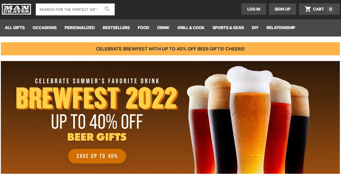
Man Crates has made an ecommerce business success by providing gift options catered to men. The individual crates can be chosen by occasion, interest, or personalized. And as a result, the website is immense.
What Man Crates does well with its design template is organize the endless options in an intuitive and simple way. It also integrates a ton of photography, so buyers feel comfortable knowing exactly what they’re purchasing before clicking on that shopping cart icon.
MVMT
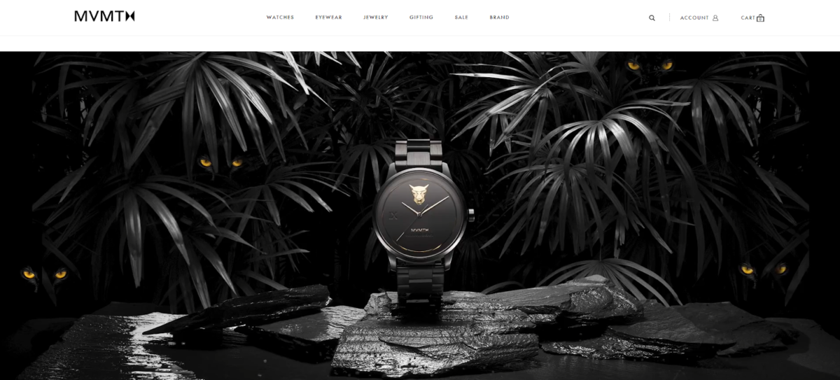
MVMT is an ecommerce store that sells watches and accessories using a contemporary site design.
The website design works well because it wastes no time moving the user from the header into the product options. The luxurious images stand out on their own, as does the section that features social proof in the form of Instagram content and a mix of lifestyle images. The result is a captivating design for inspiration and a seamless shopping experience.
Hebe
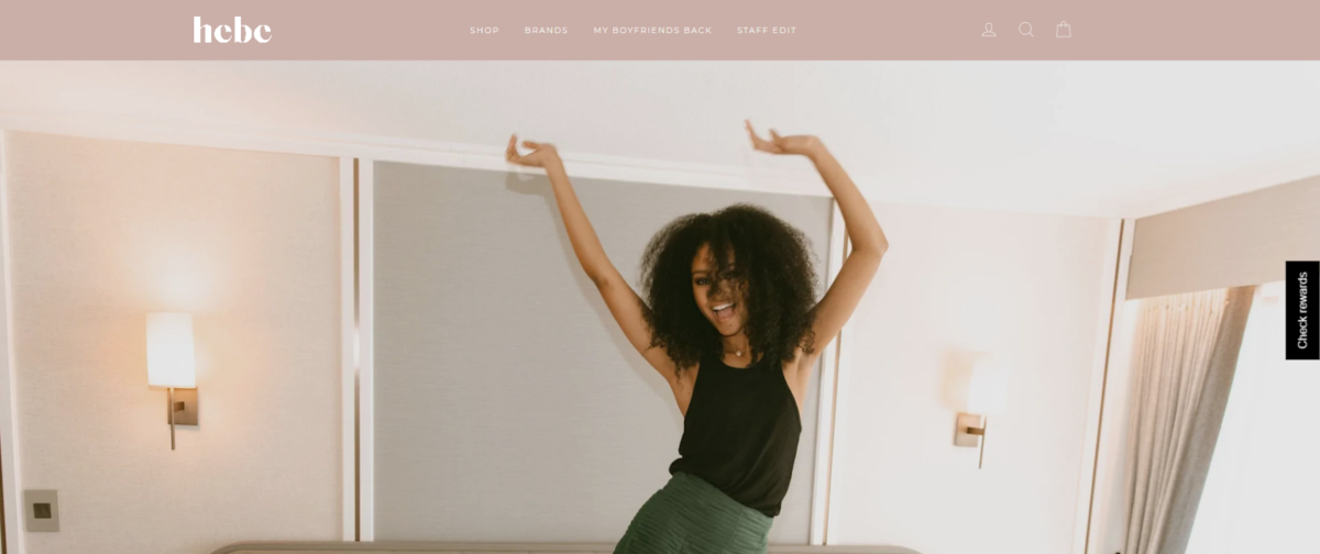
Hebe’s clean and modern ecommerce website design features playful, lifestyle-forward photography and videography, along with integrated product features, or “must-haves.”
The simplistic website design of this site, balanced with movement, allows the user to become fully engaged in the visuals and products seamlessly.

Bliss
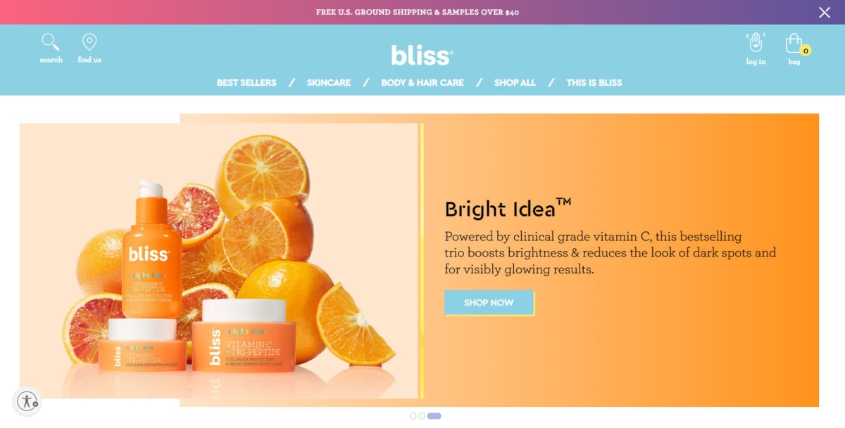
Bliss mixes photos of products, users, and ingredients throughout the site in a bright, fun way that immediately engages visitors.
Users can navigate the site easily thanks to a simple top menu and mega-menu expansion option. The mega-menu allows users to navigate by clickable links or by browsing through and using photos within the menu.
Briogeo
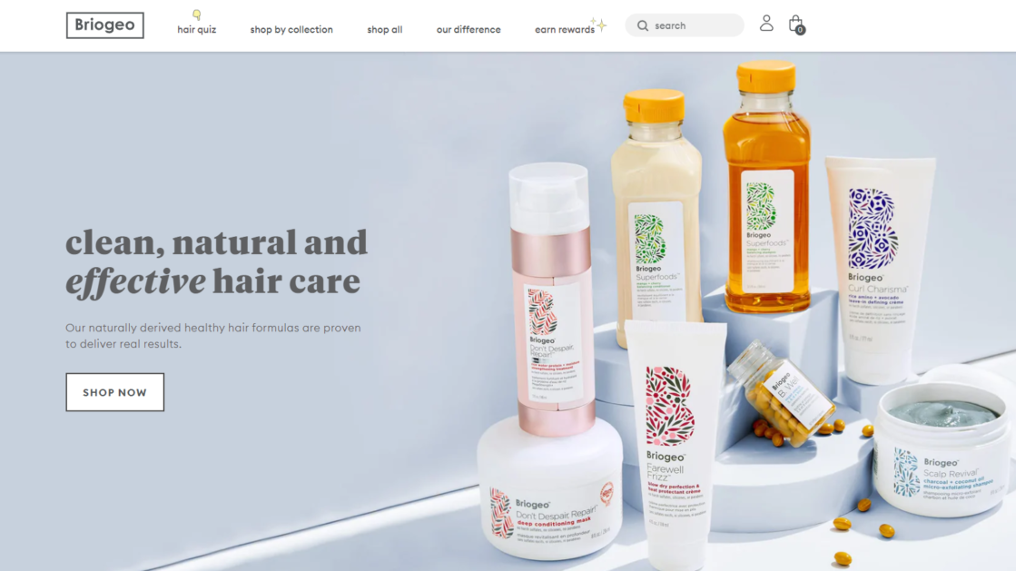
Briogeo uses a combination of bright product photography and engaging movement throughout the site. From video testimonials to illustrations that bring the page to life, this website is an excellent example of a fun shopping experience.
In addition to its playfulness, the site still makes shopping easy with clear product sections that give the user one-click options to purchase or subscribe.
Briogeo does a great job of giving its value proposition in its hero section. Right when you click to their home page, you see “clean, natural and effective hair care.” This brand lets you know right away that it cares about natural ingredients.
Dress Up
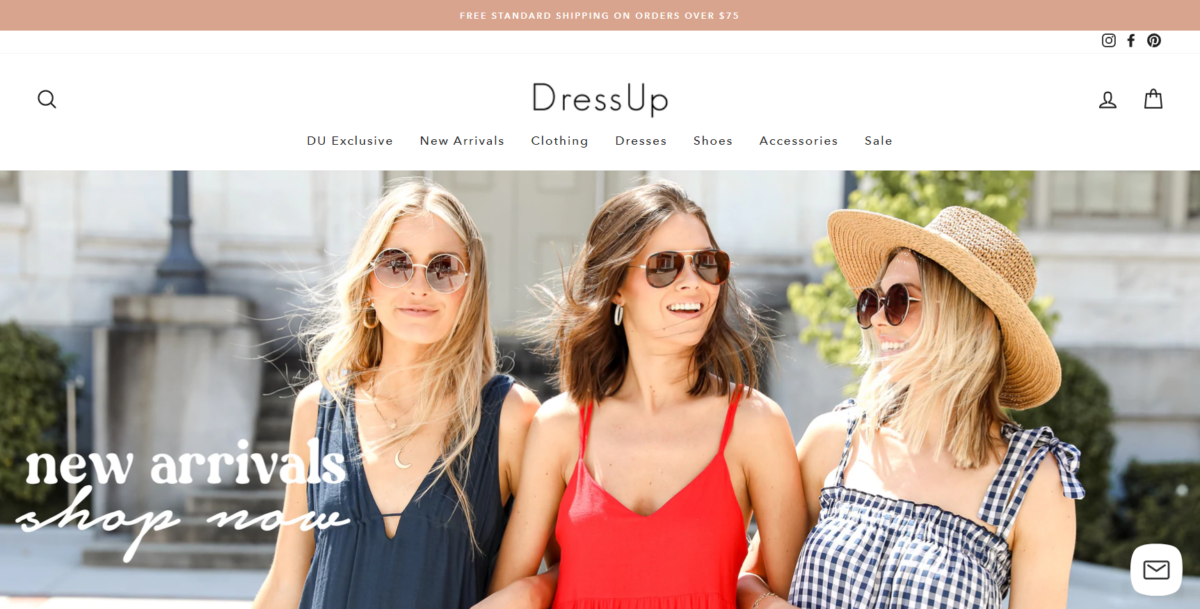
Dress Up is one of the best ecommerce websites for organizing an expansive product catalog. This website is huge, from t-shirts to dresses and shoes to everything in between. And yet, thanks to the category options on the homepage (and in the drop-down menus from the navigation bar), shopping isn’t difficult.
In fact, someone searching for t-shirts or dresses can easily click the correct image and be directed to a product page with filter options to make items even more accessible.
Bohemian Traders
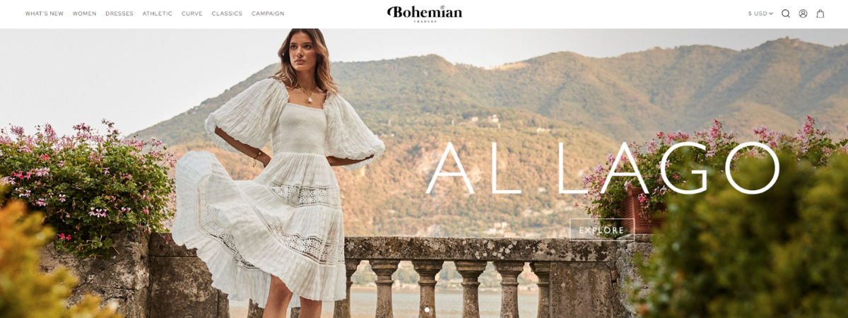
Like Dress Up, Bohemian Traders is an ecommerce business selling women’s clothing. Like Dress Up, this ecommerce website design uses photos to assist navigation, with category options primarily displayed through images.
Unlike Dress Up, individual products are featured in lifestyle pictures, showcasing how and where a given item can be used. This visual storytelling, a big part of the brand, and great design make it one of the best ecommerce websites despite its comprehensive list of products.

Chubbies
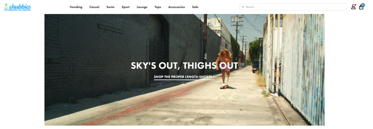
The Chubbies brand is big on weekends, and the image-heavy layout on its ecommerce website draws you into that relaxed vibe. While Dress Up and Bohemian Traders cater to women, Chubbies is a site built for men.
Like many of the other ecommerce websites we’ve covered, Chubbies uses lifestyle photography and product photos to create a fun and easy-to-use site.
PopFit
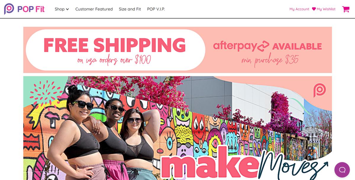
PopFit continues the theme of ecommerce websites featuring clothing, but this brand takes it in a different direction. PopFit uses lifestyle pics but also focuses on streamlined navigation that gets the user immediately into rows of products.
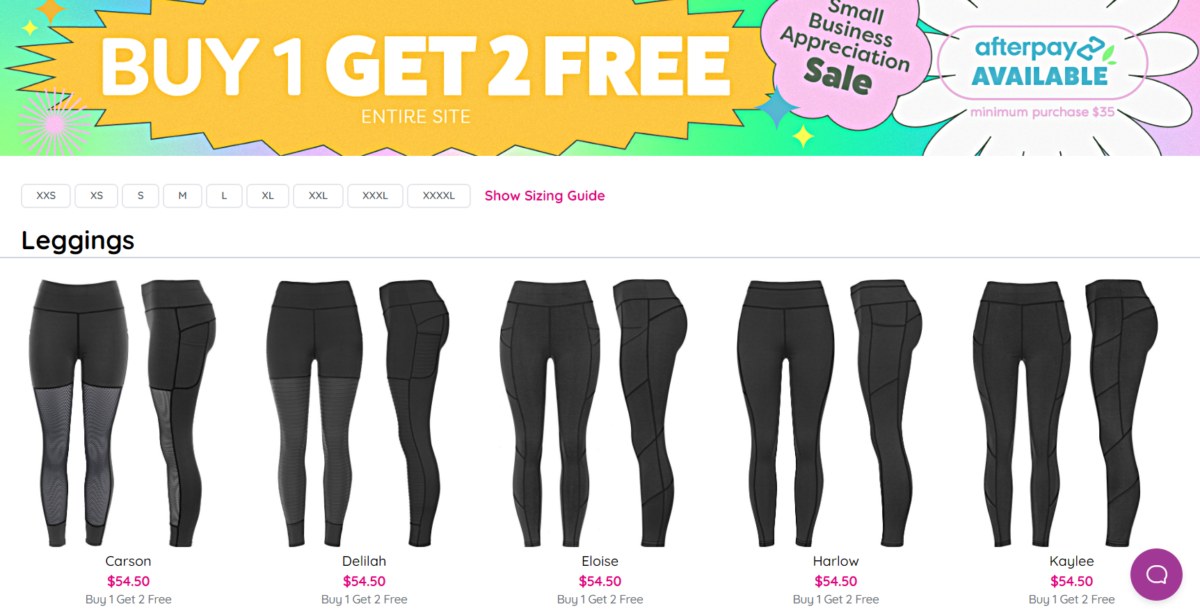
The use of simple navigation options and photos of color choices for each product means with a few clicks; the user can choose what they want in an instant.
Beats by Dre
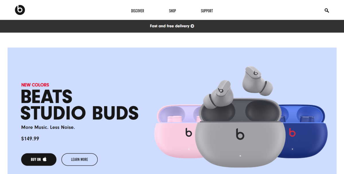
Beats By Dre is among the best ecommerce websites for its modern use of styling and imagery. The homepage options are a mix of featured posts, like where the products have been used or by whom, and actual product links.
The result of this unique approach is a website that takes you on a journey as a user and has you wanting to own a product or piece of this exciting brand.
Ambsn
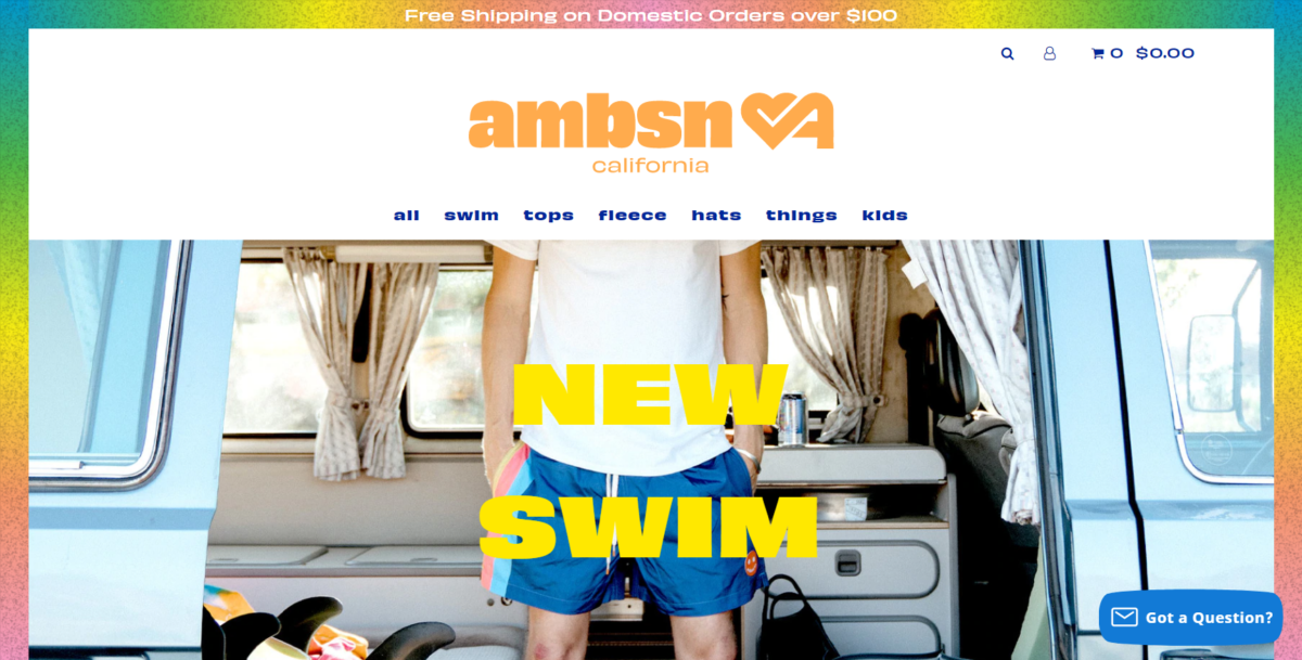
If you’re looking for swimwear (or a sticker of a hamburger), ambsn is the ecommerce site for you.
This website uses a simple top menu and sticks to product pics more than lifestyle features. But one thing the site does exceptionally well is subtly selling the brand’s value with images of product features by other recognizable brands. They also include all the possible options to share a product the customer is viewing on social accounts.
Magic Spoon
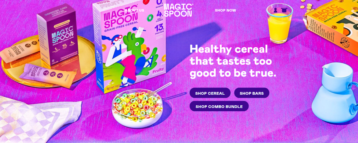
Magic Spoon stands out among ecommerce websites for its innovative branding and storytelling. The use of colorful custom illustrations, interactive elements, and movement make this site an engaging experience.

And without having to scroll, the design features an option that helps you begin to “find your flavor.” This intelligent approach to keeping a personalized action item above the fold is just one of the reasons this ranks on the best ecommerce websites list.
The Horse
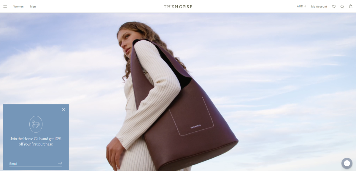
The Horse is an ecommerce brand that sells bags, watches, and more for both men and women. You will have to scroll three-quarters of the way down the homepage before you run into text, which leaves the visuals to tell the brand’s style story.
What works about this ecommerce website is how a user naturally travels through the site, drawn in by the lifestyle images and videos to discover the individual products. The uncluttered approach works beautifully for this unique website design.
Poketo
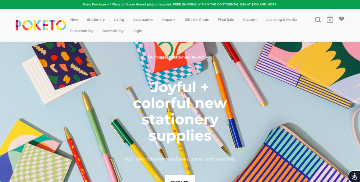
Poketo is one of the more vibrant ecommerce websites on our list and features household and personal items, from bowls and plates to socks and journals. The brand and product designs are bright and playful, and the website design follows suit with a fun and child-like web design.
Photo blocks lead to product categories, but if you don’t want to waste time scrolling, featured quick shop items (shoppable images) can be yours within seconds.
Grovemade
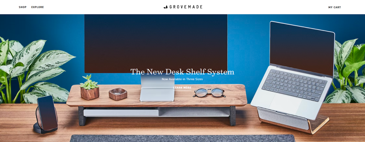
Grovemade sells products that improve the workspace, like laptop stands and mats. But unlike ecommerce websites that only feature products on the homepage, Grovemade takes up space to talk about its mission and even the people behind it.
In fact, in addition to photography that features the products and provides sources of inspiration, an entire section is dedicated to individual team pics and bios. This is a great example of how ecommerce websites can feature the products they offer and the brand’s values to which consumers are drawn to.
Mollyjogger
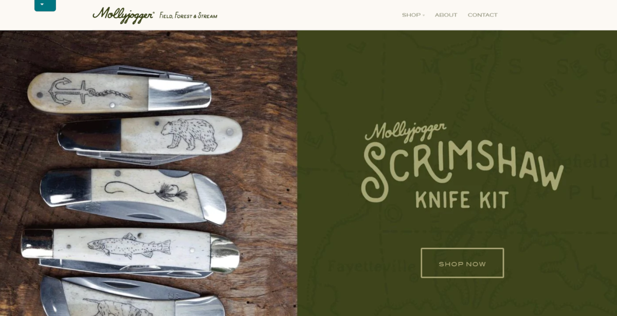
Mollyjogger is a company that’s dedicated to products that support outdoor recreation. On this site, you’ll find leather goods, match sets, and a t-shirt to begin your adventure. And while all of these items may not naturally go together, on Mollyjogger, the display of products in a featured product section make it seem like they do.

What Mollyjogger does well is the use of simple (and intuitive) menu categories, along with product visuals. For those that want to get straight to the point or those that want to browse, Mollyjogger is an easy-to-use ecommerce option.
Common Characteristics of these Ecommerce Websites
As we wrap up, let’s look at a few of the consistent themes we’ve seen from our list of best ecommerce websites.
Whether you’re starting a new online store or want to take your existing site to the next level, these characteristics will help you build a strong online presence. Each key element plays an important role in the design, from featuring relevant products front and center and integrating user-friendly online store navigation to focusing on product branding and a faster purchasing experience.
Clean and Visually Appealing Design
Photography is of great value for ecommerce websites, from lifestyle options to user-generated content to simple product pics. But the key is to balance that photography with a clean and visually appealing design that lets the images stand out.
Whether you plan to use sophisticated illustrations and product quizzes or stock images and simple responsive templates, the key is to ensure a clean design that will attract a broad audience to your online platform.
Intuitive Navigation
Whether selling one new chocolate bar or hosting thousands of products, visitors need to know how to get what you sell. Intuitive (not necessarily boring) navigation is key to taking a new visitor from browsing to shopping quickly.
Skimmable Pages
Not every consumer wants to read about the properties of that green tea you’ve created (although some will), and not everyone has the patience for a scrolling experience through hundreds of products.
Use the strategies we’ve looked at (like a balance of photos and neutral space) to ensure your pages are skimmable and don’t require much time to navigate.

Focused on User Experience
No matter what, stay focused on the user experience. From the new visitor that doesn’t know what you offer to the repeat customer that wants to place a second order, ensure your site makes it easy and quick to get what each user needs every time.
Use These Examples as Ecommerce Website Inspiration
When building an eCommerce website, remember that the site should seamlessly guide your visitors through the online experience. Whether you use a mix of lifestyle and product photography or bold colors and interactive features, your site should have intuitive menu options and straightforward call-to-action (CTA) options that encourage your visitor to take the next step and make a purchase.
When shoppers visit your website, you want them to feel like they can easily find what they are looking for. Use an intuitive menu system with clear call-to-action buttons to lead them through the buying process. You should also prominently feature lifestyle and product photography to help them visualize how the item would look in their home. If you have any interactive features on your website, test them out to ensure they are working properly. Nothing is more frustrating to a shopper than clicking on a button that doesn’t work!
