|
Guide: 10 Essential Product Page Best Practices Download this Salsify guide for more product page inspiration from top brands.
|
1. Our Place Leverages Graphics to Highlight Critical Features
Our Place’s product pages are a work of art. The brand colors are recognizable, and the high-quality pictures reflect the caliber of the product. But it’s the product graphics that really set this particular product page apart from the rest. It dissects the product and highlights the benefits and features of each individual component.
This graphic helps shoppers compare the item to similar pans while shining a spotlight on why you should choose this one and all its great features.
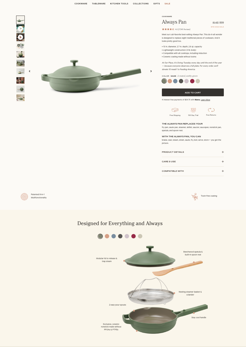
Image Source: Our Place
Product Page Takeaway: Get Visual
Instead of simply writing out the features and benefits of your products, show them in a visual format.
2. Maui Moisture Lets Shoppers Explore Other Products
Maui’s Amazon product page examples feature all the must-have elements: Clear pictures, reviews, and videos all help shoppers decide if the product’s a good fit for them.
But, even if that particular product isn’t quite right, Maui helps consumers find something that is: The slider on the product page lets shoppers explore different products in the range, complete with their unique pros and cons.
In the study by Think with Google mentioned above, 88% of shoppers said that product selection and variety are important to them when choosing which brand to buy from. By showcasing more of the products in its range, Maui is much more likely to get a conversion on one product or another.
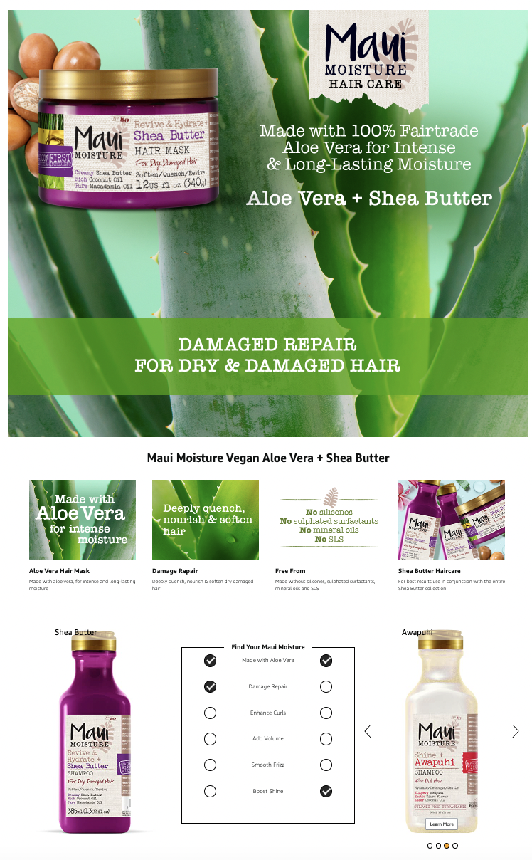
Image Source: Amazon
Product Page Takeaway: Compare or Be Square
Help shoppers choose the right product for them by creating comparison charts with other products in your range.
3. UNIKITOUT Uses Personality In Its Product Description
There are more than 75 million product listings on Amazon, according to Gadget Review. That’s a lot of competition. Standing out requires a descriptive product title and a description that touches on customer pain points but still has a bit of personality.
UNIKITOUT achieves all of this on its kitchen set product page. The product title goes into great detail, increasing its chances of showing up in the search results, while its product bullet points are punchy and personable.
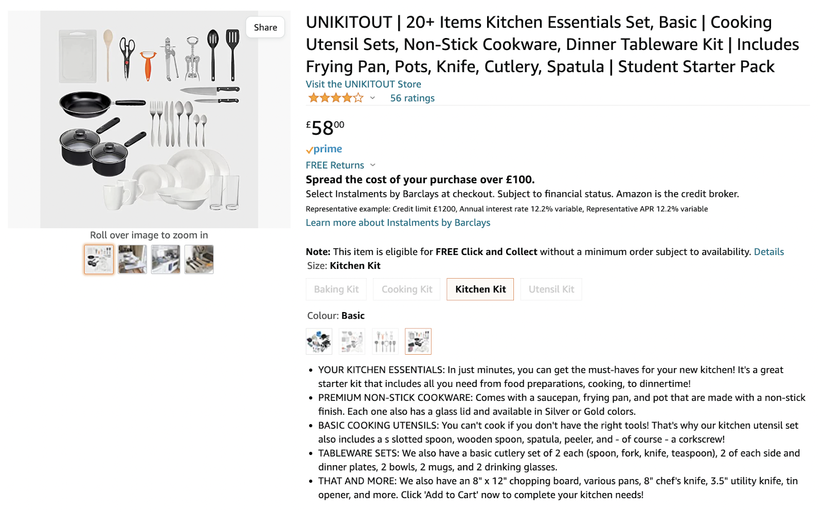
Image Source: Amazon
Product Page Takeaway: Bullet Points Shouldn’t Be Boring
Jazz up your bullet points with punchy copy that taps into customer pain points.
4. Drunk Elephant Uses Interactive Elements to Engage Shoppers
Drunk Elephant is a pro at interactive product pages — and is definitely one to peruse for some fabulous product page examples. As you scroll further down the product detail page for the Lala Retro Whipped Cream, you’re greeted with more and more useful content. There are also plenty of reviews and high-quality images of the product, as well as a step-by-step guide to using the product.
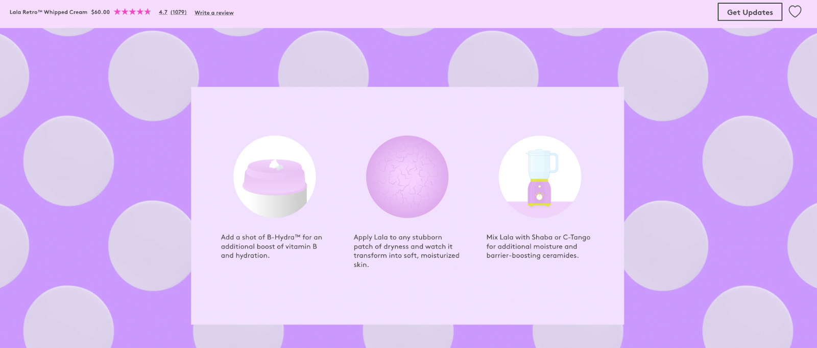
Image Source: Drunk Elephant
Even better, there’s an interactive section that lets shoppers click to find out more about the sustainable ingredients used in the product.
In an age where consumers are increasingly conscious about their carbon footprint and impact on the environment, this provides reassurance while creating a unique and fun way to get product information.
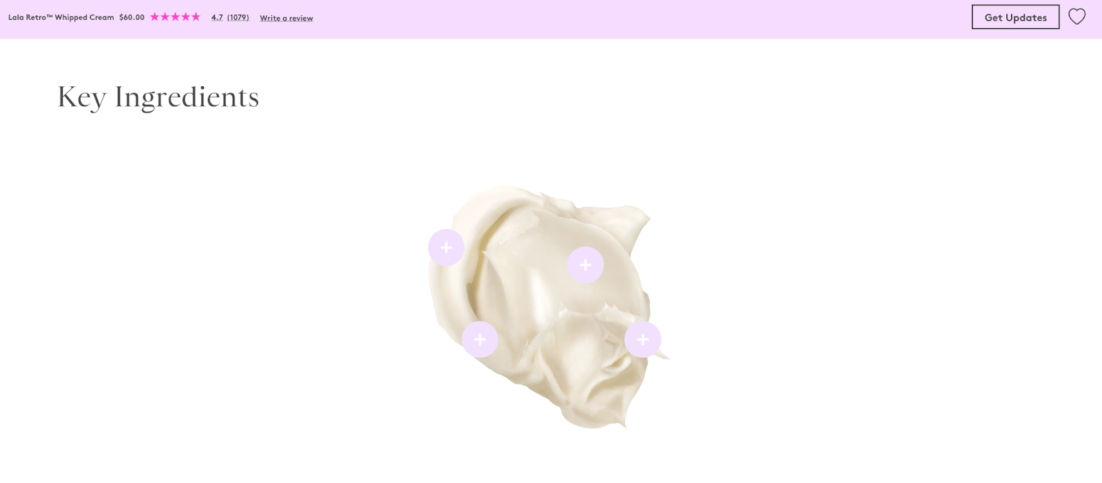
Image Source: Drunk Elephant
Product Page Takeaway: Make Your Information Interactive
Take customers on a journey and include information that’s important to them, like ingredients or where your materials are sourced.
5. Welly Uses Illustrative Graphics to Reassure Shoppers
Welly is well-known for its plucky copy, and its Bravery Bandages exhibit this perfectly and showcase some great images as well. Who would have thought you could build a compelling image gallery out of a pack of bandages?
But think about it: Online shoppers can’t touch a product or see it in person before they buy, so they rely on visuals. Welly’s selection of high-quality pictures, including one showcasing the measurements of each bandage, leaves consumers in no doubt about what they’re buying.
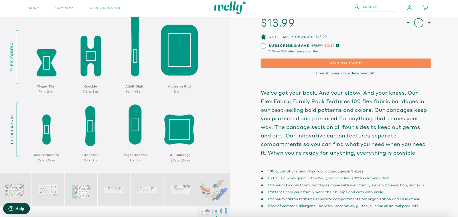
Image Source: Welly
Product Page Takeaway: Photo Quality and Quantity Matter
Don’t be afraid of sharing too many photos and videos. Customers want to get a good picture (pun intended) of a product before they buy.
6. Keurig Lets Customers “Try Before They Buy”
Keurig plays on the choose-your-own-adventure strategy on the product page for its Pod Coffee Maker. Consumers can click “Try It” on the first image and choose what they want to see the product do. This is a great way to showcase use cases and get shoppers to engage with the product.
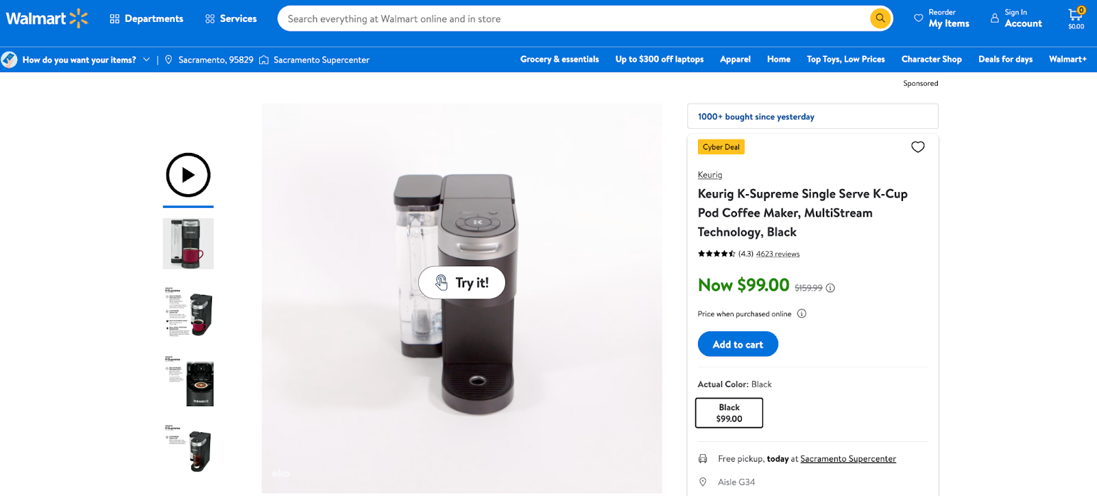
Image Source: Walmart
Product Page Takeaway: Show Your Product in Action
Highlight product use cases in an interactive way to engage shoppers and keep them on-site longer.
7. COOLIFE Incorporates UGC To Influence Purchase Decisions
As noted by Eclipse, user-generated content (UGC) is 8.7 times more impactful in influencing purchases than influencer content, and 79% of people said UGC plays a huge role in their purchasing decisions.
COOLIFE taps into this by sharing a library of customer-created videos on its Amazon product page for the Spinner Hardshell Suitcase. There are a number of unboxing videos and content showing the suitcase in action so shoppers can get a real feel for what it’ll be like in person.
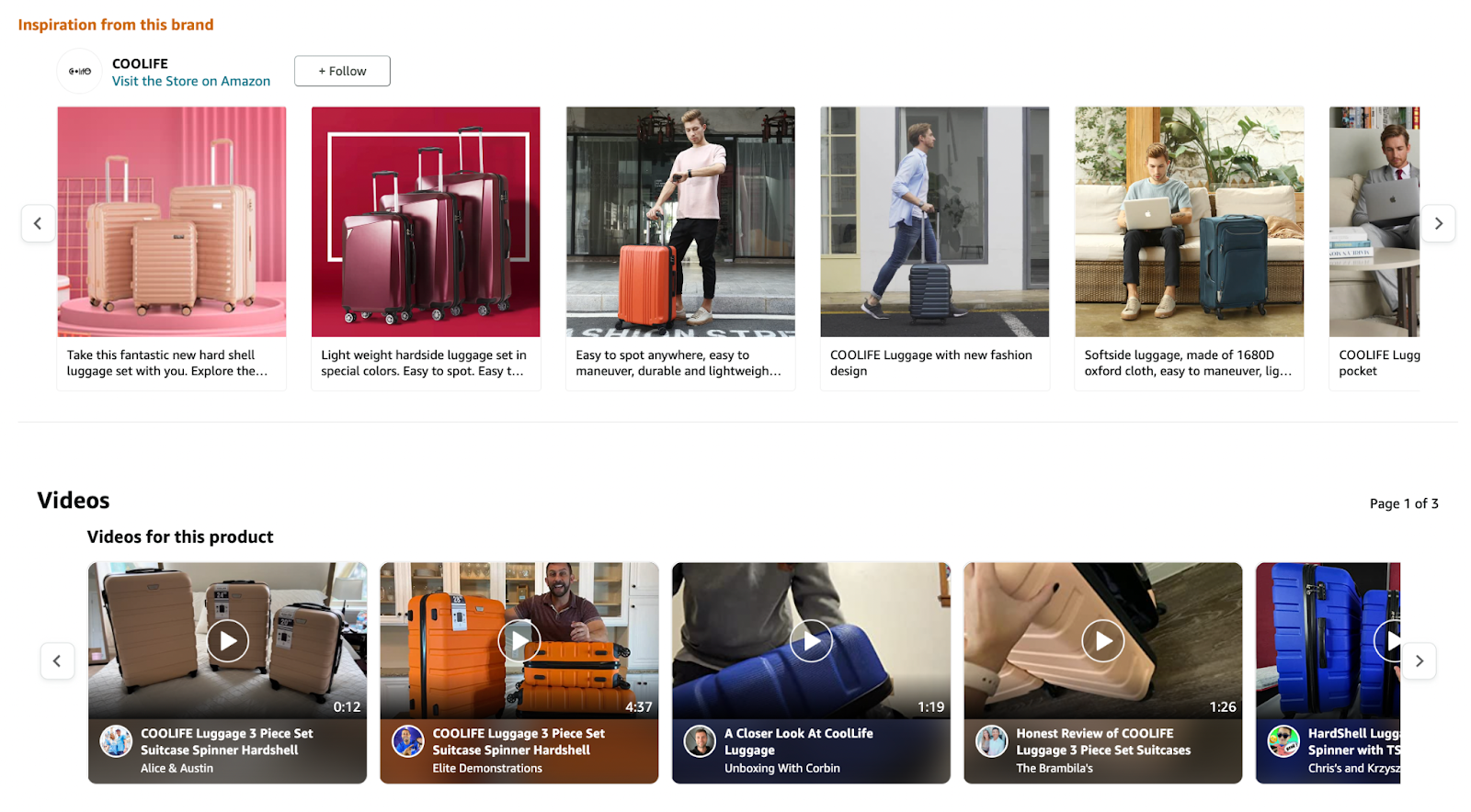
Image Source: Amazon
Product Page Takeaway: Have Users Help Users
Incorporate UGC in the form of photos and videos to give shoppers the confidence to buy (and show your product in action).
8. Allbirds Uses Searchable Attributes to Help Shoppers Find What They’re Looking For
As noted by Qualtrics, 91% of 18 to 34 year olds trust online reviews as much as personal recommendations. And, according to Salsify’s “Consumer Research 2022” report, 43% of shoppers in the U.S., 44% in the U.K., 40% in France, and 35% in Germany used reviews to determine what to purchase either online or in-store.
Allbirds takes this research and runs with it, adding searchable attributes to its reviews so that shoppers can find like-minded shoppers. Reviewers are asked to share their size and what they use the product for so future buyers can get a better idea about whether it’s a good fit. 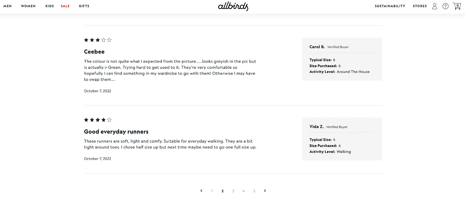
Image Source: Allbirds
Product Page Takeaway: Attribute Filters Are Your Friend
Elevate customer reviews with attributes so shoppers can find like-minded consumers and read only the most relevant reviews.
9. Oat Haus Shows Shoppers How to Enjoy Its Products
Oat Haus’ branding is colorful and fun, so it’s only natural its product pages reflect this. In addition to beautiful images and copy brimming with personality, the brand also includes a section that shows shoppers how to best enjoy the product. Providing delicious use cases sparks shoppers’ imaginations and pushes them toward a sale — very clever.
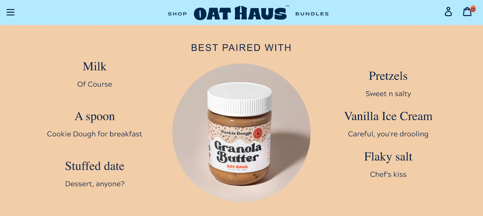
Image Source: Oat Haus
Product Page Takeaway: Inspire Potential Buyers
Spark inspiration with imaginative use cases — get customers thinking about what it would be like to use your product.
Jazz Up Your Product Pages
You, too, can have your product pages among the best of the best product page examples. After all, these pages are a crucial touchpoint in the customer journey. If they don’t have the right information (or enough of it), shoppers will go elsewhere.
When reworking your product pages in 2023, consider what elements you need to stand out. Make sure to commit to beautiful images, videos, reviews, and relevant information that answers questions and tackles objections.


